Site Builder
Highlighted Features
Pages & Blocks
Build and customize your church's website easier than ever
Small Groups Manager
Connect with believers through Bible study and fellowship
Holiday Bundles
Save time preparing for your biggest services of the year
Sermons Manager
Watch, listen, and share inspiring biblical messages
Events Manager
Stay updated on church gatherings and special occasions
Online Giving
Enable secure and convenient donations for your church
Use Case
Next Steps Framework
What makes Ministry Designs different? Find out here
More Website Visitors
A church website is only as good as its flow of traffic
More Sunday Visitors
An effective website will help drive visitors to your church
More Community
Encourage more connections weekly through your website
More Engagement
Your website should be the central hub for all church activity
More Small Group Attendance
Small groups made clear, accessible, and easy
Increased Visitor Engagement
Make it simple, point new visitors to your website
More Efficiency
Intentional communication leads to higher efficiency

To start we’re going to talk a little bit about the concept of a church annual report.
Now, the first thing that might come to mind for many of us is what is an annual report in the first place?
Even if you’re one of the few that actually knows what I’m talking about, I would ask this: are you aware of how important a church annual report can be, not just as an accountability benchmark for an organization, but also as a ministry tool?
80,000 Free Church Graphics
GROW YOUR CHURCH & TELL YOUR STORY THROUGH YOUR ANNUAL REPORT
That’s why I’ve written up this guide. I don’t only want to show you things like what should and shouldn’t go into an annual report or the difference between a good report and a bad one (although I do want to cover that too!).
I also want to communicate how amazing a tool this seemingly minor piece of administrative minutia can be for your congregation …and your ministry as a whole!
Whether you’re aware of what it is or not, your church annual report is one of the best tools that your church can use to reach both your congregation and the local community. Let me explain.
Chapter 1
Ah, the annual report...
Viewed by many as a simple, brief, rather pointless summary of a few facts (or sometimes more than a few!), this little document…
Ah, the church annual report…
Viewed by many as a simple, brief, rather pointless summary of a few facts (or sometimes more than a few!), this little document, which has long lain dormant and generally fallen right off of most church leadership’s radar, possesses the potential to be one of your best bets to both fire up your congregation with some passion and momentum as well as equip them with an amazing tool to take to other potential new attendees.
A well-crafted annual report is a perfect way to communicate what your ministry has been doing and how God has been working through your church.
It’s an excellent opportunity to bring the facts and figures that are usually discussed behind closed doors in leadership meetings and amongst elders, out into the open, where the congregation as a whole can be both informed and encouraged by them.
From tithing and gifting to attendance, baptisms, church vision, testimonies, and a plethora of other things, your annual report can effectively summarize where you’ve been as a congregation, and where the Lord is bringing you now.
It can also help keep you on track with mission statements and goals. What did you plan on doing last year? How far along did you get towards each goal you set? Did you surpass any these goals? How does all of this affect your vision for the upcoming year?
But, of course, (and you saw that of course coming, right?) as with all channels of communication, there’s a right way to make your church annual report …and a wrong way — er… one wrong way? Scratch that. Try a TON of wrong ways!
What should be included in a church annual report?
For starters, let’s make one thing clear: we’re not talking about a tax document, nor a business presentation.
This isn’t just reporting finances or productivity.
It’s a story, even if it’s often a data-driven story.
Therefore, one should always, and I mean ALWAYS, link the information included in one’s annual report to a relatable story. Don’t just leave a number or a statistic hanging out in the ethers. That kind of stuff is for lawyers and accountants.
Church is about life.
Now, when the rubber hits the road, the way that the church — and I’m using lowercase on purpose here, as we’re talking about local church bodies meeting in actual church buildings rather than the universal “Church” — operates in our local communities requires the tracking and reporting of numbers and other statistics.
But really, at its core, the uppercase “C” Church is about LIVING THE GODLY LIFE!
As the Church, we’re about living full, true, exciting, meaningful lives, and we need that to shine through in our annual reports.
When to introduce your church's annual report?
The church welcome speech is a perfect time to communicate God's impact through your congregation. Because of their willingness to let God use their time and resources, your church is making the impact it is. God is using the people of your church to incredible things. There is no better time than on Sunday morning during the welcome speech at Church to share that information.
80,000 Free Church Graphics
What are the key elements of a church annual report?
So, you might be wondering at this point how a “good” annual report should look. After all, many churches have them in one form or another, but only some are using them effectively.
I’ll break down many of the most crucial elements as we go, but for those of you who are skimming, here’s a brief overview of the most important things that go into a good annual report.

Meaningful Stories
This is the “fancy” part of the report, the part that keeps everyone reading. It takes the information and shows how it applies to direct, real-world examples that actually happened within your congregation.

Stats, numbers, and achievements
This, of course, is what everyone is looking for when they open the report. But while things like attendance, tithes, and giving, baptism numbers, etc. can be great to read about, you want to make sure that you’re presenting all of this in a way that isn’t going to overload the readers!

Pictures and videos
This is the “wallpaper” part of things, and it’s the part of the process where you really want to avoid a “business presentation” feel. No tacky powerpoint slides, no spreadsheets, just a nice, clean, fun looking shell of visuals to hold the meat of the presentation: the information.

Calls to action
It sounds like an odd place for this, but a good annual report can be a great place to have a handful of calls to action. What better place to encourage your congregation to get involved than when they’re taking a look at what your church has been up to?

Plans for the future
The final flourish, after filling everyone in on how the last year went, is including an overview of your future plans. This is the ideal way to finish things off on an upbeat, positive, energetic note that leaves everyone excited for the future.
Alright, now that we have the basics, let’s dig in a little bit and take a look at what each of these elements looks like up close.
What exactly should you be looking for as you go to put your own report together?
Let’s start with the stories.

How to use stories for maximum impact
One of the most common signs of a successful church annual report is that time has been taken to highlight the stories first and foremost.
This includes things like positive and encouraging changes, accomplishments as a church body, individual testimonies, etc. It’s the vehicle that will allow you to insert information into the narrative rather than vice versa.
In fact, “the narrative” is a good phrase to bring up here. Keep that idea of a flowing NARRATIVE in mind the whole time you’re building your report. If you find yourself wandering into mindless minutia and yawn-inducing details, back up and find the loose end of the narrative wherever you left it and get back on track!
Just remember, let the stories and overall narrative drive this thing! In other words, yes, you’ll be including some financials and other info, but only once readers have bought into your story.
Let them know that all of the stats and numbers aren’t the focal point.
Here is a good example from Gateway Church of the narrative driving the numbers:

Remember, it’s how the statistics relate to the real, day-to-day life at your church that truly gives them purpose.
You want people to be excited about facts and figures because they see how they directly relate to them and how they can connect them to what they’ve been doing.
You want your information to fit into the story and not take over the focus.
LCBC Church does a great job keeping that mind as you scroll through their report.

Think of it as taking a test in school. If all you’re worried about is getting a perfect grade, you’re going to walk away from the test with little more than a temporary sense of accomplishment. If, on the other hand, you pass the test with flying colors because you know the material, THAT is what’s going to have a long-term impact on your future. The statistical “grade” is irrelevant in the shadow of the actual fact that you understand what you’re studying.
To tie that back in with your church’s annual report, don’t focus on the “good grade” of high tithes and attendance numbers, make sure to tie them back to the true success, the fact that your church is a healthy, loving congregation of God-honoring people doing life together. The facts are just the side-effects of what really counts.
Because of this “real-life” factor, it can be really helpful to take some time before drawing up your report to
talk with your congregation and pick their brains regarding what stories they think might be the best candidates to highlight.
What accomplishments have been achieved this year? What stories stand out and deserve being retold or metaphorically “cast into stone,” so to speak.
80,000 Free Church Graphics

What narrative is Gateway communicating by highlighting this achievement…?
…They want us to know that they care about people!
This is a great way to find some good, collective “IFTBUM!” (It’s fun to be us moments!) as my friends over at unseminary.com would put it.
This is also a great way to highlight and specifically call out members of the congregation that have gone above and beyond for your particular church in the last year.
It can give them a little recognition for their hard work, and showcase to others where help is needed. Be tactful, of course. We’re not trying to “puff up with pride” here, just recognize the humble servants in our midst!
Pro Tip: I would suggest that you open up a shared Google Doc or some other file that your leadership can have access to. This will give you a spot to hold any good stories or testimonies that pop up throughout the year, allowing you to record them WHEN THEY HAPPEN. It’s always better to get that info written down as soon as you can! Also, write all of it down. Don’t leave out any details when it comes to notes. You’ll be summarizing it into bite-size bits of info for the report, but don’t shoot yourself in the foot by forgetting the details when you first write it down, only to be left high and dry six or nine months later when you go to recap it for the report!
As a summary, the goal here is to INSPIRE right from the get-go. Then, once you’ve got your congregation excited about the stories they’re seeing, THAT is when you hit them with the info.
Now, if at this point you’re wondering, “O.K. Tyler, but what about that information, though? What does it look like? What does it include?”
Don’t worry! It’s definitely important too!
…which is exactly why we’re covering that one next.
The facts and the numbers
This is the real “meat” of the report that people will be looking for. Make it easily accessible and digestible.
It’s the pièce de résistance of the whole report. But rather than being the “main dish,” delivered all at once, you want to “spread it out” amongst all of the courses, so to speak.
The real goal here should be to get the hard facts and information subtlely yet plainly (this can be difficult, I know!) woven in amongst the pictures, videos, stories, testimonials, and overall narrative.
Please don’t just starkly report big, scary numbers like total giving for the year, baptisms, or attendance.
I’ll repeat: ALWAYS try to connect these statistics to a story.
I know it sounds like I’m beating a dead horse here, but it’s so crucial! An isolated number is only going to encourage people to glaze over. What does it mean? What’s the story behind it? How does any specific fact connect to your overall ministry activity and mission statements? How does it connect to specific events and outreaches?
While you don’t want to wax on and on (more on the length of your report further down), don’t be afraid to get into some of the details with this stuff! It does a world of difference in making this a personal, satisfying experience that encourages rather than overwhelms.
O.K., I’ll stop going off on bunny trails and finally get to the details on the information itself now.
Here we go…
Some of the more common “facts and statistics” that you might find on a good annual report for your church include things like:
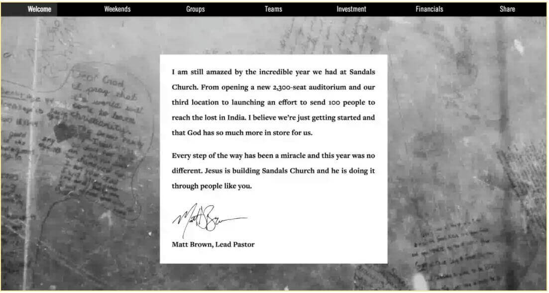
A Letter From the Pastor: This is a common opener. It can be anything from a brief introduction to a more thorough exposition (although if it gets too long, you may want to put a starting “segment” of it on the report with a redirecting link to a separate webpage where the full letter can be located. Again, the presentation is key here. Don’t overwhelm everyone with a full-blown “pastor’s report to the church” right from the get-go!) Here’s a good example of the length you should consider from Sandals Church in there 2015 report.
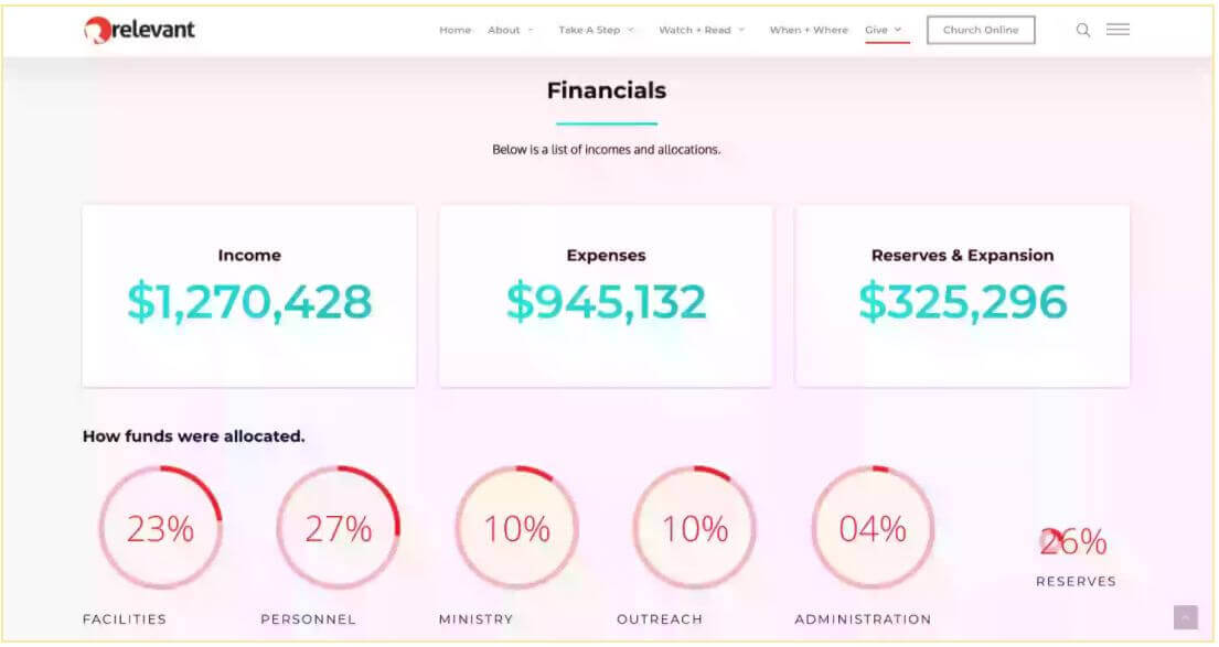
Monetary Statistics: This can include things like tithes and donation totals (given to the church); the amount that the church has given to other causes like missions, programs, or local outreach; costs of events or building projects (include some quotes or testimonials on the stories about what that money went towards!); and so on. The reason I LOVE Relevant’s report is because it’s amazing and they aren’t a megachurch…. Yet.
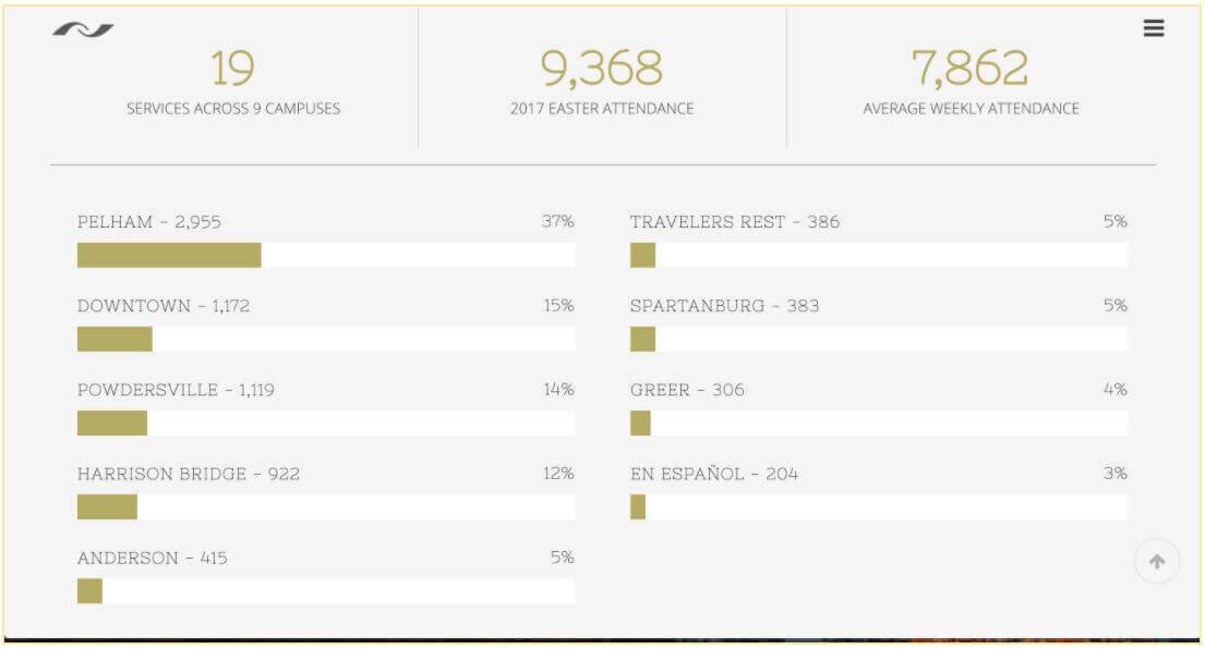
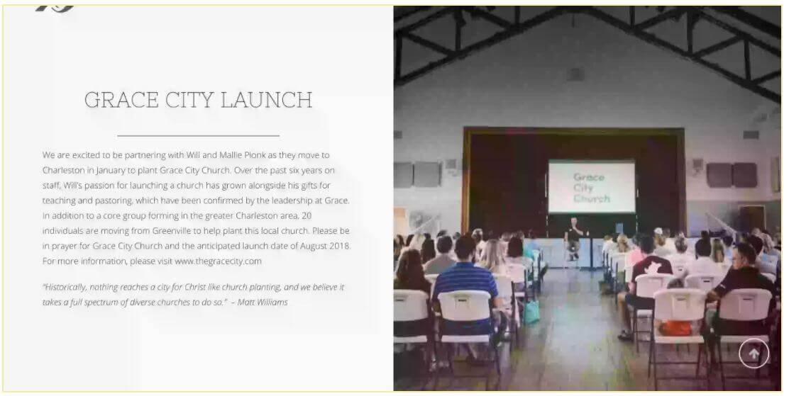
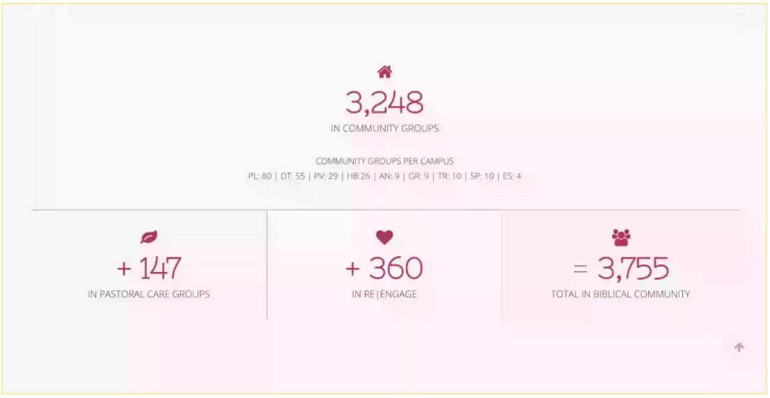
People: This one is easy to leave at a simple attendance number and move on, but why stop there? You can use it to explain why the numbers have changed, what efforts and outreach campaigns you’ve done to help with attendance, how many new visitors versus new members you have, and so on. Similar to what Grace Church in South Carolina did, but with slightly more supporting information. I love the way they’ve communicated the growth, but why are they growing? What’s support the growth and how is it sustainable?
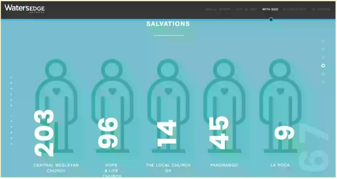
Recorded Salvations and Baptisms: These are other common figures to see on a report. Again, though, a cold, hard number isn’t going to convey much (and can even sound like bragging.) Try to keep it in the context of how those numbers support the narrative. Waters Edge with which is lead by Holland Central Church in Holland Michigan. They are now merging with smaller churches to help support their offers. This is a perfect example of how to communicate salvation while not taking credit for the efforts.
80,000 Free Church Graphics
Updates on Small Groups and Ministries: This one is less of a “hard statistic,” but it can be a good chance to update how any of your “sub-ministries” have done over the past year. Have any new ones started? Have any finished up? Have any benchmarks or goals been reached? This is a great opportunity to share this …along with some great testimonials!
Missions: One of the best things to communicate in a church annual report is missions. How many missions trips did your congregation go on? How many missionaries did they send out? How many are they supporting from afar?

Online Stats: Do you have a church website? Facebook page? Instagram account? Do you stream your sermons live online? If so, how many views have they gotten on average? How about in total? Any way that your church is impacting the online world can be reported here. As you probably know, not many churches do church online as well as Elevation Church. Here’s an example of how they’ve communicated their success.

Miscellaneous: Other things that come to mind are outreach to the local community (you can present this as a number of hours served), conferences, info on different church campuses, and the list goes on. In general, any piece of information that you feel is important to report to your congregation on an annual basis is worth considering here.
These statistics don’t need to be mutually exclusive either. They can, and should, be overlapped when appropriate.
For example, a statistic like attendance rising dramatically can be super encouraging. On the other hand, if giving doesn’t seem to have correspondingly gone up it can serve as a good chance to remind your congregation that a healthy new influx of attendees does not automatically mean tithes go up as well.
Alright. Now that we’ve got some of the data under our belts, I’m going to say it one more time for good measure before we move on: minimize those numbers and maximize those impact stories. Explain why a number is a good thing, why it matters, and why it’s more than just a “good grade.”
If your numbers aren’t infectiously spreading your vision, helping building momentum, creating excitement, and overall getting everyone pumped, there’s a good chance you’re not presenting them well.
Get creative! Find the best way to talk about each and every stat you choose to include.
How Should They Look?
Did you know that around 65% of our fellow humans are visual learners? (As a side note, that’s why I’m such a nerd for a good infographic. Visual + Information always wins!) That’s why I ascribe to the view that a good annual report for a church should almost look and feel like a magazine.
Now, before you cringe at my flippantly casual comparison of churches and magazines, let me explain myself.
Take a second and think about what a magazine looks like.
It’s not just a wordless picture book! A typical magazine consists of a bunch of information, stories, highlights, statistics, etc. …all of which are set amongst a bunch of colorful, thought out pictures that relate to the story in one way or another.
This is a great way to approach how to lay out your church’s annual report.
The easiest way I can think of to put it is to consider it a magazine for your church that is obsessed with telling all of the awesome stories going on …and “has” to include some information somewhere in the mix.
Taking this visual-driven approach is the best way to ensure that your readers are “likely to read it and much less likely to discard it.”
Of course, two of the best ways to do this is to include photos and videos.
Pro Tip: I’m not talking about getting a bunch of “model-esque” stock photos of your congregation posing and “saying cheese.” Instead, try to get photos of people “doing life.” I would suggest that you task some of your leadership, or perhaps a photographer or two that you might have in the congregation, to try to get photos throughout the year. Again, get a good online spot like a Google Drive to dump them in and, hey presto, you have a great selection of photos for your report when the time comes!
Infographics. I already mentioned them earlier. Trust me, they’re awesome. If you’re not familiar with them, an infographic is simply a visual representation of specific pieces of information. You probably see them all the time on popular blogs or even your Facebook feed.
They’re those pictures with text on them that, you know, catch your eye and get you to stop!
It’s a great idea to include some infographics in your annual report in one way or another. My favorite annual report templates literally make the whole thing feel like a continual, flowing infographic! (I include some case studies further down in the article that have some excellent infographic examples).
Another really great way to include larger chunks of information without overwhelming your readers is to present it in some sort of dropdown or expandable element.
This allows you to bulletize or summarize something on the surface of the report without cluttering things up, but still gives you a spot to put the information “under the surface” for anyone looking to read more about a particular subject.
Also, if you’re building your own annual report, remember to keep the technical details in mind.
How are people going to be reading this? Is it a PDF? Is it a JPG? The best bet here — and my personal recommendation — is to go with an online version that will work across all platforms.
Now that we have some good ideas in mind about what we should do to help create a visual, “magazine-esque” annual report, I want to give you a couple of quick examples of what not to do.
This is the first page of a not-so-great annual report that I stumbled across. (I’ve gone ahead and blocked out the name of the church as I’m not in any way trying to besmirch anyone here! This was just a perfect example that visualizes what I’m trying to explain!)
80,000 Free Church Graphics
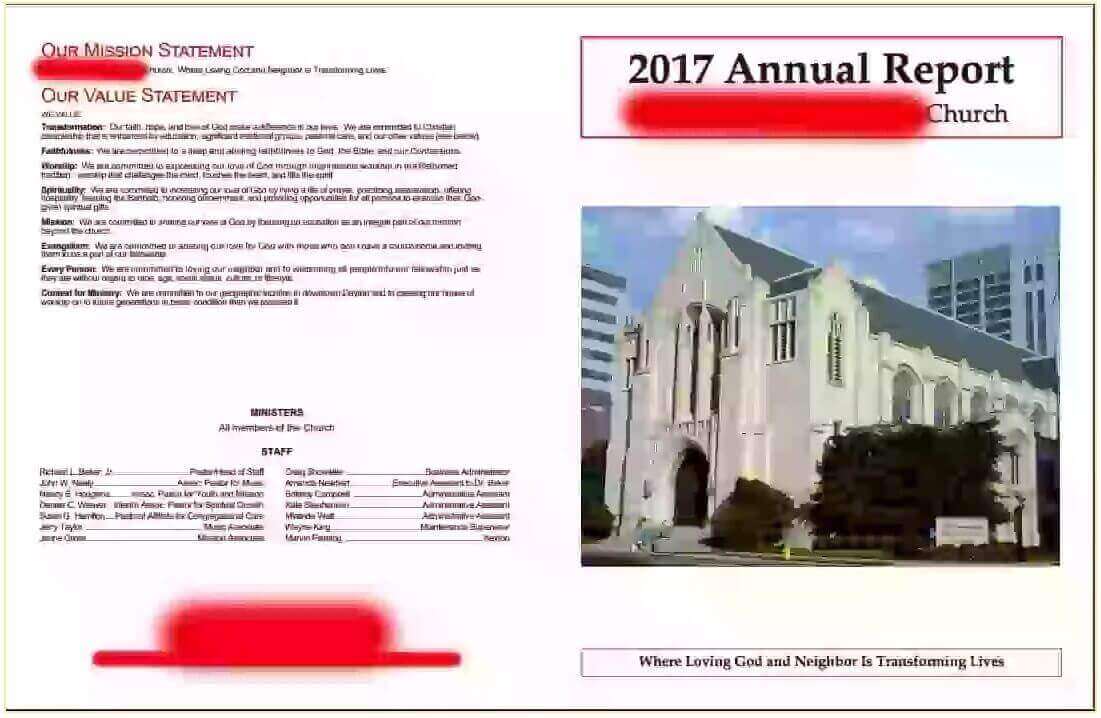
Can you tell what might make this undesirable as an annual report?
Well, there are quite a few things actually.
For one thing, there’s way too much information, especially for a cover page.
Even further down though, things didn’t get much better. The report just opened up into a massive information dump that was, frankly, so overwhelming that even after looking it over for a while, I still have very little idea of anything that was specifically being communicated.
There were entire pages that read like textbooks, graphs that conveyed little-to-no tangible message for a casual reader, and again… TOO MUCH INFORMATION!
I mean, it felt like they were doing pretty well as a congregation, but that was about it.
Unfortunately, this isn’t a one-off annual report, either.
For example, another one that I found for a church operating out of southern Florida was much better but still largely missed the mark.
They had theirs posted online, it had pictures and videos, and all around started off pretty well.
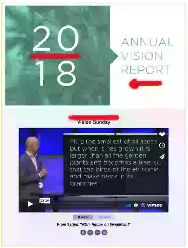
But pretty quickly problems began to arise. The church’s first piece of information was a 33-minute video. No, I didn’t hit the “3” key twice by accident. It was literally, an entire sermon on the church’s vision.
Now, don’t misunderstand me here. A sermon on a church’s vision is an entirely appropriate thing to do. And including a reference to it or even having it somewhere on your report is a great idea!
But leading with it? Please, no! As soon as anyone begins reading, he or she is confronted with the daunting task of listening to a half-hour message… or already opting out and skipping part of the report.
This doesn’t help engage your audience. If anything, it puts them in a skimming, cursory mindset from the beginning.
Once you skip or watch the video, you hit a quite long, but good note from the pastor, followed by some basic church graphics showing vision, mission, and core values. So far so good!
Then, a cool, well laid out infographic. Awesome! Except…

The entire thing was literally about the local region of South Florida that the church was based out of!
Talk about throwing readers off course! They should have sent this off to the local city hall for their website!
Personally, I would have kept the “#1 Most Never-Churched City in America” part as a quick factoid about the local area as a super-simple infographic and then moved on.
From there, the report sways back and forth between well-presented, bite-size pieces of information and large swaths of text that quickly cause that ever-feared glazed over look.
Calling all pastors! You don’t want that glazed over look from the pulpit when you’re preaching, right? Try to avoid it with your annual reports too!
Do you see why I’ve been trying to communicate the visual, story-driven part so much? It’s easy to fall into the trap of treating an annual report like a tax form. Just get the information, fill it out, and get it up.
But, as much as it’s easy to poo poo flashy elements like pictures and videos, these really can be crucial parts of a report that help make them interesting, encouraging, and above all, digestible.
It truly does help to SHOW your congregation what results their giving has created in your church.
Make this an experience!
This isn’t a humdrum chore that they’re being forced to do. Everyone who reads this thing willingly clicked on it and, usually, will be eagerly looking to see what your church has been up to.
The Well-Placed Call To Action
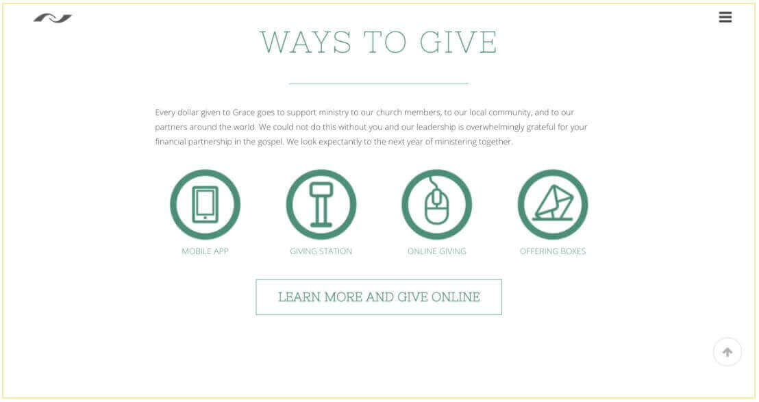
This one can feel out of place with what many view as a somewhat static summary of the past. (Hopefully, you’re starting to see that it’s more than that at this point though!)
The truth is, CHURCH Annual Report is an ideal spot for some well-placed (e.g. NOT TACKY!) calls to action.
Think about it. You’re putting a bunch of facts and data in front of your reader’s eyes showing them how things like small groups, outreaches, tithes, giving, and so much more has been going over the last twelve months.
It’s a great time to include a gentle nudge for anyone holding back to get more involved.
“See how our tithing has helped us give to these missions? Please consider becoming a part of this impactful ministry!” “Look at how many baptisms we’ve had! Have you been baptized yet?” “We have so many people attending our life groups. Are YOU plugged into one?”
A good call to action can be a great side benefit of any annual report.
Now, as I already mentioned, I have a bunch of good reports up my sleeve with examples of many of these things, but I’ve given them their own section further below.
For now, let’s cover the last element of a good annual report…
The Vision
It shouldn’t surprise anyone that the main focus of an annual report is the history of an organization. Usually, with church annual reports like these, it covers the last twelve months and talks about all sorts of cool things that have happened during that time.
This creates a sort of time capsule or a historical account you could say, freezing the best moments of your church’s history into a place where you can look back and see what God has done throughout the years that your church has been in existence.
But not only is the historical part of an annual report important. There’s also that utterly crucial final step, sharing your vision of the future.
If the facts are the main course — the pièce de résistance of the meal so to speak — then this is the amazingly presented final course, the eye-popping dessert that you don’t want to leave out no matter how full everyone is!
Why?
Because it refocuses the momentum (and everyone’s excitement) in a forward-thinking direction.
Remember, this isn’t a final report, it’s just an annual one. Bringing the attention back to your future vision takes the natural momentum built by reading the report and shows what you see God doing down the road. In many ways, this is a forecast of next year’s report.
But it doesn’t have to stop at next year. You want to cast your vision far into the future. As long as the Lord keeps your doors open, you want to keep soaking in His vision for where you are going next as a church, as a congregation, and as a community!
As a final note on this, you can also use the vision part of your annual report to re-emphasize how your church does things. Remind readers of your priorities, values, etc. basically, anything that makes the way that you do things stand out!
80,000 Free Church Graphics
A Few Things To Keep In Mind
Keep Things Short: I mentioned this one further up in the article, and the point is pretty straightforward. While visuals are a key element to your church’s report, you don’t want to go including a million charts and graphs or long, storied paragraphs of text. A few well-placed visuals of the data and some summarized text to go along with it, all of which should be relevant to your congregation, are all that you need!
Check out the sections in one of our Annual Report Templates:

Be honest.
While your annual report should absolutely focus on the positives of your experience as a congregation over the past year, don’t use it as a chance to spin facts or cover over less exciting news.
If it comes across that you’re not being entirely honest, you’re turning a blind eye to things, or you’re leaving statistics out, it does not help build trust and encouragement between you and your congregation. In fact, it can do quite the opposite.
Remember, we are all in the service of the Lord, and it’s His will being done. Allow His work to shine through your report on its own and He’ll take care of the rest!
Be down to earth.
Hopefully, I’ve made this one pretty clear by now, but I thought it deserved a quick shout out on its own. The whole point of an annual report is to present information for the world to see, not your accountant. Make sure you’re not using high-minded terms or super “Christianeze” statements. Some of the latter can’t be avoided, but you want your annual report to be something that anyone (from your church or not) can read with relative ease.
Sure, you might refer to things here and there that only your congregation will fully understand, and that’s perfectly fine, but try your best to keep things down to earth whenever possible!
Do a “final pass” when you’re done.
Once your annual report is complete, it’s a great idea to step back and give it a good, honest look from the mindset of a “casual observer.”
Most people reading the report will do what we all do online, namely: skim it.
Sure, they’ll stop when they see your awesomely placed, eye-catching infographics, or perhaps when they come across a section that they’re particularly interested in, but once again the important thing to keep in mind during this final pass is that your eyes don’t glaze over. Remember those examples I gave you earlier. Even an apparently “good” report can still be way too overwhelming once you start to scroll.
Do you see the main message you’re trying to convey without reading every detail? What jumps out at you?
Pro Tip: Give the report to someone who isn’t closely involved in leadership and ask if it’s understandable and if the main messages come through. This can be a great way to test if you’ll get the results you’re looking for!
This “final pass” is a crucial part of the process, making sure that you’ve made something that is going to perform well and not just take up space and gather metaphorical “E-dust” on your site.
The grammar police…
Anyone who’s spent more than three seconds on Facebook or Instagram probably knows that there is a weird effect that online social media has on people’s behavior. For some reason, many people are willing to brazenly point out errors and correct others in online situations where they would never do the same in a face-to-face conversation.
So, let me humbly yet strongly suggest that you PROPERLY PROOFREAD your annual report. Make sure you get extra, skilled eyes on it so that no one’s distracting everyone else by pointing out silly little grammar corrections.
This one is of the utmost importance particularly when it comes to everyone’s names. Don’t insult people by getting their names wrong!
If you don’t have a good editor available, you can also consider a more powerful automated editor like Grammarly, too.
Prepare for next year now.
Don’t rest on your laurels once the report is posted, start thinking ahead right away. It’ll make next year’s report easier to pull together and most likely it’ll dramatically increase it’s quality if it’s on your mind for 365 days rather than just the week before it needs to be posted.
Start gathering photos, bookmarking videos, and recording stories, testimonies, and any other important data!
My final tip here is to gather feedback on your current annual report to see how next year’s report can be improved.
WOW… What an action pack chapter…
Are you ready for me?
Let’s keep it moving….
Chapter 2
How to get the most out of your Annual Report
O.K., so at this point, you’ve got your stellar, story-focused, fact-filled, picture-driven annual report that is going to blow everyone away.
O.K., so at this point, you’ve got your stellar, story-focused, fact-filled, picture-driven annual report that is going to blow everyone away.
…but what do you do with it? How do you get it in front of everyone?
I mean, you can pop it up on an obscure page on your website like “www.thebestchurchintheworld.com/annual-report,” but really, who’s ever going to stumble on that?
As we are all abundantly aware of by now, your annual report is many more things than just an award or decoration on your church’s website.
For example, we know it’s can be a great communication tool. It’s a way to reach out to anyone visiting your site that might want to come to your church.
It’s also an excellent, factoid-loaded tool to give your congregation to both encourage them and help them in their personal outreach for your church in particular. Of course, sharing the Gospel is something that isn’t driven by facts and data, but when it comes to finding a good church, you want to show why you stand out!
O.K., so if we don’t want to just let the report sit in a dark corner, what should it be doing?
Let’s take a few minutes and go over some of the best ways to use your report.
First off, don’t let my sarcasm stop you from hosting the report on your website. That actually is a great idea for an initial move. It’s easily accessible and, if you’ve used good website builder, can adapt to mobile screens that way. This is even more true when you use a good template.
However, popping the report up on your site can’t and really SHOULDN’T be the only thing you do.
Once it’s “live”, you’re ready to start promoting it to your congregation, and consequently to the world! Here are a few of my top recommendations for the best ways to help make sure your report gets some good web traffic.
80,000 Free Church Graphics
Make the Link Contagious:
Spread the link around your site wherever it makes sense. If you’ve got a page for giving, add it on there as an encouragement for those preparing to support you to see the good work that your congregation is doing.
If you’ve got a page with additional info, an about us page, or any other relevant spot, throw it on there!
Talk it Up:
You can’t beat the raw power of simply telling your congregation during your Sunday service that the annual report is up.
You don’t need to make a big deal out of it. Pop it into your announcements circulation for a few weeks or even have it on the overhead projector before or after the service for minimal interference.
However you decide to do it, though, let people know and make sure to focus on the narrative side of things. It’s really a summary of your last year together as a congregation. People will be excited to hear they can pop online and see how things are going.
Also, make sure to focus on that last bit about your future vision! People love to hear where things are headed down the road, too. It helps a congregation stay focused, on track, and involved with the program(s) that the church is involved in.
In fact, this last part, updating everyone on the future vision as a part of a report on the past year, is a good excuse to give a couple of extra updates throughout the year as well!
Email It:
If you have an email list, send out an E-blast when the report is ready to let everyone know and point them to it. Again, remember, focusing on stories and testimonies are key here.
Make sure to keep things light and exciting!
You can also send the report to any new members or financial donors as they get involved throughout the year as a nod to their participation and an invitation for them to take part in things knowledgeably rather than just giving their hard earned tithes and charitable gifts into a “black hole” that never tells them what’s actually going on behind the scenes.
Tax Season:
Ah, tax season, that time of year when all churches need to look around and gather up information for everyone’s contribution statement.
Now, you can easily just give them a statement with the important numbers for their taxes, a quick thank you, and a pat on the back. But why not include access to your annual report on there as well? It’ll add some genuine value and also give a little bit of life to something that is otherwise quite “business-y” in its overtones.
Chapter 3
Some examples of good Annual Reports
As promised, here are five excellent church report writing examples of some well-made annual reports.
As promised, here are five excellent church report writing examples of some well-made annual reports. They hit factors like having good visuals, incorporating stories, and communicating the mission of the church.
Extra Note: One of the most commonly searched examples of a unique annual report is Elevation Church’s annual report. However, while theirs can be quite fantastic, they set the bar pretty high right from the get-go, and I don’t want to give you unrealistic that you can’t accomplish on your own. I’m going to include it as a note here and focus on some more realistic reports that were still handled really well in my examples.
Waters Edge Network

This first report is from a community of churches known as Waters Edge Network. Right from the first glance, it’s obvious that these guys have got the whole “visual” thing down. Everything is presented in an easy-on-the-eyes fashion that draws the reader down the page.
However, in this report, there’s one thing in particular that I want to call out: The intro.
When it comes to kicking things off, they hit the nail on the head.
Starting with a nice image and a simple header, as you scroll down, the first thing they give you isn’t a lengthy chunk of text “from the pastor” that drones on and on, immediately turning the whole experience into something the reader “has to get through.”
Instead, the first thing they do is hit you with who they are and the mission of the group. This is followed up by that “letter from the pastor” element, but it’s tastefully hidden by a hyperlinked box titled “Letter from Pastor Craig.”
For those interested in reading, if you click on the box a section opens up with another visual and two parts: on the left is a bullet point quote while on the right is the letter — embedded in the form, allowing the reader to scroll through it if they wish.
This avoids shutting the reader down with a barrage of text on the screen, instead inviting them to read on if they want to.
Whenever the letter from the pastor is more than a few paragraphs, it’s always a good idea to host the letter somewhere else and link out to it or do what these guys did and simply hide it. It’s still there, it’s just not taking over.
Grace Church

This 2017 church annual report from Grace Church in SC is quite exhaustive, yet presents all of its information in a very digestible way that encourages readers to “keep on scrolling.” While this is another example that did a very good all-around job with the report, there are two things that Grace Church handled particularly well.
First, there’s the presentation of the facts.
There is A LOT of it in this one, from attendance numbers across 9 different campuses (with a really great motion-driven breakdown of the numbers) to website stats, social media links, summaries of what was taught throughout the course of the year, and so on. Each of these pieces of information is thoughtfully and carefully presented in a visual format that doesn’t bombard the reader with information, opting rather, to tactfully show just the most important bits.
The other great thing that Grace Church did was to casually include testimonies of individuals and couples that had been specifically affected by the church throughout the year.
These testimonies, scattered throughout the report, help to break up the data and provide little snippets and insights into how all of this information affected the lives of individuals actually attending the church.
It adds a splash of color and life, bringing things down to a personal level that readers can relate to.
Shepherd Church
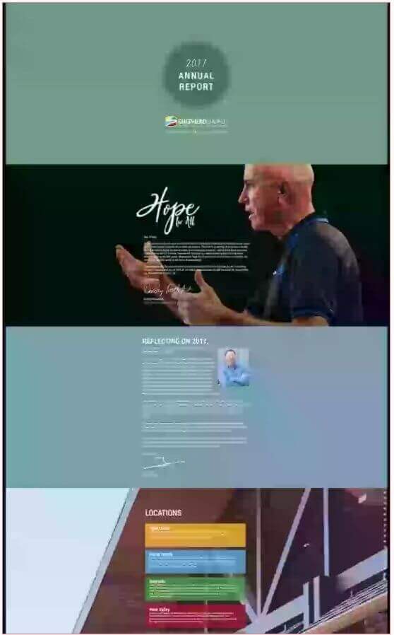
While all of the reports I’m including here use visuals and infographics very well, this church annual report from Shepherd Church has a handful of very good examples that I wanted to point out.
In particular, I’m drawn to the pie-charts here.
They’ve included them but haven’t saturated the report with them. The first one divides up the baptisms for the year between “Beach” and “Weekend” baptisms, while the second is a rather comprehensive breakdown of the church’s budget.
That second one, in particular, is a great way to handle a rather overwhelming bit of data.
They put two pies, one for the overall budget and another for the ministry breakdown, including actual dollar figures as well as accompanying percentages for quick reference.
While infographics can present a host of different facts in different ways, these are some great examples of how they can help break up even the most doldrum elements of an annual report while adding in a splash of color at the same time.
Relevant Church
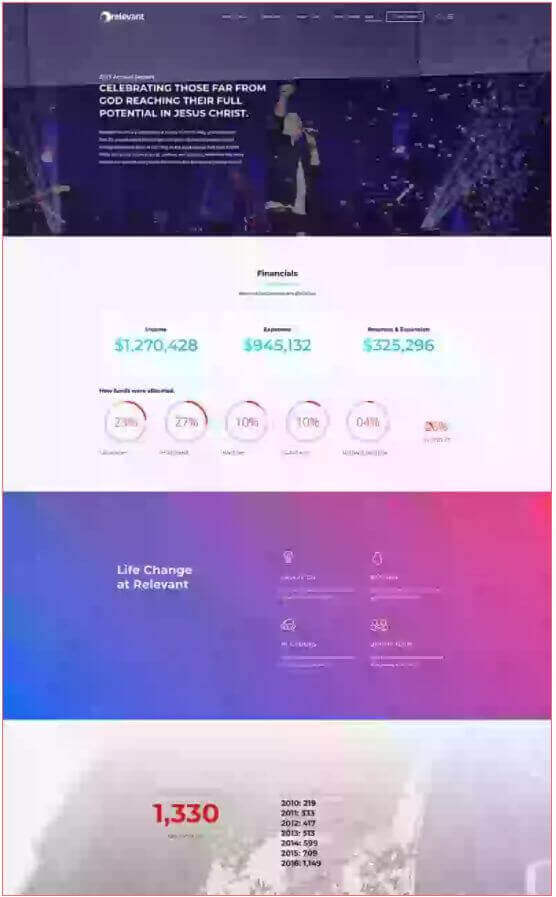
Relevant Church Annual Report is short and sweet, and I wanted to include it as a counter to the extra long one I used further up for Grace Church.
The point? Not all reports need to be lengthy and information-packed. The important thing here is that you hit the right information.
Case in point, Relevant Church’s report gives financial figures and breakdowns (in visual ways), a couple infographics on some important points like salvation numbers, small groups, and attendance, and then wraps things up.
The other thing they do, and which we didn’t talk about much thus far, was put an accountability factor in there.
At the bottom of their report, they included links to the last five years of reports, allowing everyone to openly see what’s happened in the past and compare it to where they’ve come since.
Austin Stone Community Church
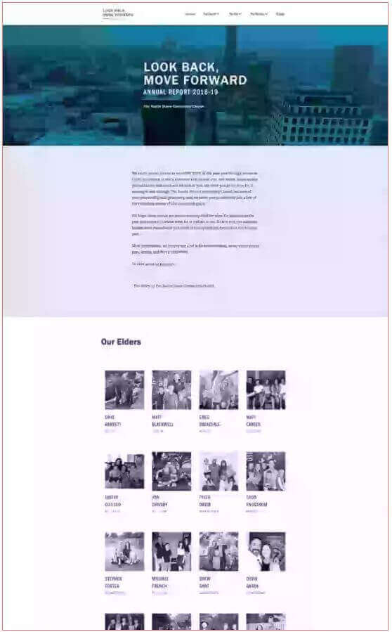
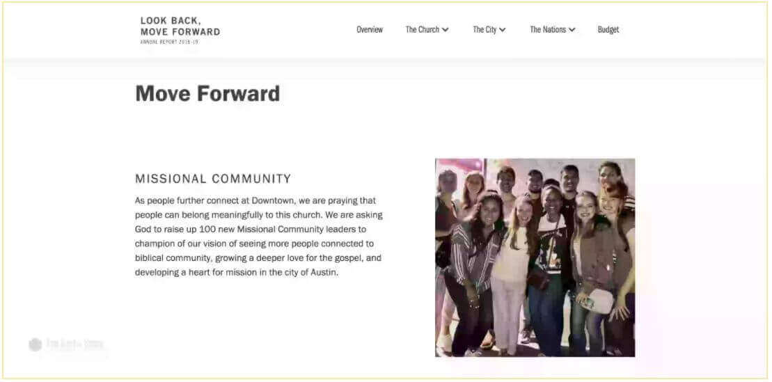
While this report from Austin Stone Community Church lacks a little bit of the flair of my other examples, I wanted to include them for one important reason: casting vision.
The folks at Austin Stone have devoted multiple sections of the report specifically to “moving forward.” In other words, they take sizeable chunks of room in their report to talk about where they want to go.
I can’t stress enough how much this is a wise thing to do.
It may be planned and less driven by hard facts, but casting a vision for the future is exactly where you want to leave everyone when you’re done with the report. Otherwise, you’ve just given them a bunch of factoids that show them that their church is doing well.
Pro Tip: As a little bit of bonus material, here’s a great breakdown of an annual report that I came across during my research. The post is several years old, but the checklist of things that Will Mancini from churchleaders.com highlighted from the report is still very relevant in the modern church culture.
80,000 Free Church Graphics
Chapter 4
O.K., so we've gone over what an Annual Report for your church is
O.K., so we’ve gone over what an annual report for your church is, what it looks like, what elements it should include, and even some great examples of good reports that are already out there.
The benefits of a prebuilt church Annual Report template
O.K., so we’ve gone over what an annual report for your church is, what it looks like, what elements it should include, and even some great examples of good reports that are already out there.
The question is, how can you get one for your church, right?
Well, for some of you the answer might be already sitting right in the pews.
For example, I already mentioned trying to find photographers (or even videographers) who are already in your congregation and seeing if you can get them to help document the year for you.
You can also gather existing stories and information and keep it on hand to use in your reports alongside the other data as well.
When it comes to making the design of the template itself, I really do mean it when I say that I’m a BIG proponent of hosting your report online.
PDFs are an acceptable way to do this, but really, overwhelmingly the best option for you is to get it hosted online using the subdomain “annualreport(year).yourchurchdomain(dot)com. This makes it easy to share and keeps things looking relevant.
If you’ve already got a tech guru in your midst that you can go to in order to help get everything up online, then you’re good to go. Gather up your pictures, videos, data, and stories and have them smooth it out into whatever structure you decide you want your report to have!
However, for those of you who don’t have recourse to a whizz kid to “make it all happen,” my crew and I at Ministry Designs have pulled together some really great predesigned church report templates that can make the whole process go really quickly and painlessly.

You can choose from several different church annual report designs and layouts, open them up, and then just plug in your info and you’re good to go!
The best part I like about being able to offer this service is that if you have any issues with the templates (although we really do make them easy to use!), we’ll be there to help you along the way, so you won’t get hung up on any technical issues!
And there you have it, my definitive guide to annual reports…
Sure, it’s easy to get caught up with viewing your annual report as a mind-numbing duty that you have to pull together at the end of the year (almost like a pre-tax season exercise!) but I’ll leave you once more with the challenge to BREAK OUT of that mentality!
Your church’s annual report is an amazing opportunity! It’s a chance to share testimonies and stories, visuals of your congregation doing life together, some important facts and figures, and that all-import casting of your vision for the future.
Please don’t treat your annual reports like homework. Treat them like the ministry tool that they are!

