Site Builder
Highlighted Features
Pages & Blocks
Build and customize your church's website easier than ever
Small Groups Manager
Connect with believers through Bible study and fellowship
Holiday Bundles
Save time preparing for your biggest services of the year
Sermons Manager
Watch, listen, and share inspiring biblical messages
Events Manager
Stay updated on church gatherings and special occasions
Online Giving
Enable secure and convenient donations for your church
Use Case
Next Steps Framework
What makes Ministry Designs different? Find out here
More Website Visitors
A church website is only as good as its flow of traffic
More Sunday Visitors
An effective website will help drive visitors to your church
More Community
Encourage more connections weekly through your website
More Engagement
Your website should be the central hub for all church activity
More Small Group Attendance
Small groups made clear, accessible, and easy
Increased Visitor Engagement
Make it simple, point new visitors to your website
More Efficiency
Intentional communication leads to higher efficiency
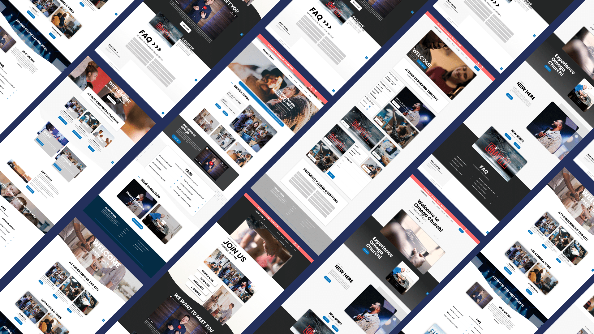
Omega by Ministry Designs: Church Website Templates
As a church website builder, Omega has everything your church needs to create an aesthetically clean, pleasing, and functional church website. Omega has a library of over 20,000 images and video resources that website users can use to create a unique website that communicates the ethos and beliefs of the church.
One thing Omega does better than any other solution is it has a proven framework specially designed to help churches reach more people built natively into the templates.
ALPHA Church Website Template Framework
Is Your Church Website Helping Your Reach More People? Click Here To Find Out For Free.
The ALPHA church website framework is designed with four key pillars designed to ascend people through the digital relationship-building process with your church.
Discover Your Church

Your church website is the most valuable piece of marketing collateral your church has access to. Our free church website templates come highly optimized for Google and other search engings to make sure people can find your church.
Is your Church Likable?

When people find your church because of your website, will they like what they see? That boils down to designs and that's where our templates others and specifically a wordpress theme.
Do People Trust You?

Are you answering the questions that people are asking when they get your website? Here are a couple examples... Are my kids safe? What do I wear? Where do I park? What can I expect when I walk in the door.
How Do We Engage

Will people know what you want them to do on your website? The following templates address all these needs and more.
Additionally, the builder has applications to help churches incorporate a bulletin board, upload sermons, implement online learning, create a donation page and accept payment and other functionalities niche to the churches. Crucially, the added functionality is not prohibitively expensive for churches.
For instance, the donation page and payment processing functionality cost nothing other than the standard transaction processing fees. The online learning functionality can use video and graphic elements, and drag and drop builder are available for free from Omega's resources library. All in all, churches do not have to part with a lot to create bespoke and adequately functioning website that caters to their specific needs.
Is Your Church Website Helping Your Reach More People? Click Here To Find Out For Free.
Here is a list of the best church website templates
Here is a list of the best church website templates for 2023. Below each of the images you'll have the ability to click through to either do a full preview and buy the template and Omage which will help you start reaching people immediately.
Kit 1 - The Classic Looking Church Website Template
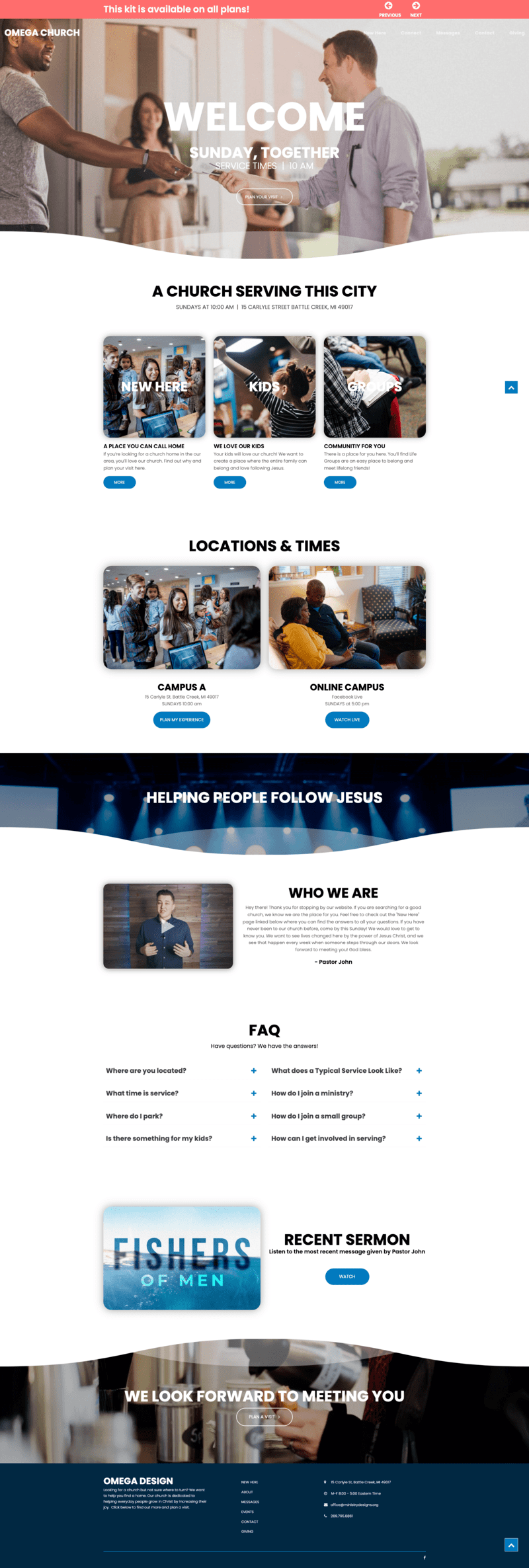
The classic look is the original Omega theme and builder design. In many ways, it's the foundation on which Omega built the other 9 church templates and the genesis of what the Omega website builder has grown to become today. While the design has been around since the beginning of the website builder, it is still an effective church template that thousands of churches rely upon even today.
The website template design is clean and elegant. Despite being a clean design, the Classic Look does not lack anything that a church would need to create an attractive and functional website that's also SEO optimized.
The template arranges blocks and elements logically, ensuring your traffic can intuitively interact with your church website. For instance, the above fold section of the homepage entails an image with a text field to introduce your church succinctly and effectively. Scroll down, and the template has tile sections that you can customize to display priority information that the traffic needs to know. This is followed by an information block where churches can embed a video. The FAQ section helps the church to answer common questions that website users might need.
User Expriance Optimization
The Classic Look features an intuitive navigational menu to help website users explore the site and learn everything the church offers. The header/primary and footer menus can be customized to navigate you across the entire website. Plus you get a native recurring events calendar and sermon manager.
Additionally, the website template is also designed to be easy to use. The template illustrates its focus on usability by including the FAQ section, which allows churches to answer some of the more popular questions regarding the organization they receive, particularly from new members.
Search Optimization
The template makes it easy for churches to optimize their website for search engines. For instance, while the FAQ is important to new visitors to get answers to the more popular questions, this section is also essential for optimizing the "People Also Ask" section of SEO . Google maps comes already imbeded making it easy to update.
Additionally, the template also has a section dedicated to NAP at the footer. Optimizing for NAP is an essential part of local search engine optimization.
Church Website Template | Kit 2 | Clean & Flowing

As the name suggests, the Clean & Flowing kit has a clean design that uses minimal design elements. While it utilizes a minimalist and flowing approach design philosophy, it's still well-optimized and feature-rich with a modern feel look and feel. The template's clean design is especially notable for giving users a great reading experience. It extensively uses small text blocks that make for a pleasing reading experience.
For instance, you can customize the home page with text blocks with embedded images. While this might seem like a mundane feature, the text block with an image background helps to communicate with website users while livening up the user experience the site can render to its traffic.
You can also customize the homepage with a FAQ block, allowing you to customize the website to meet the needs of website users intuitively and seamlessly.
Template SEO Optimization
This template makes it easy to optimize the website for local SEO. With most churches targeting a local audience, local SEO is essential to their website optimization. To this end, the template includes a NAP section and an integrated location with Google maps at the footer. Additionally, with the website optimized for user experience, it also ticks many of the SEO optimization boxes.
Steller User Experience
The template is cross-browser and cross-device compatible. Church Websites made using these templates can scale to small smartphone screens without losing functionality. We've also tested the church templates on large laptop computer screens and small Android and iOS browsers, and it works perfectly across these devices.
Another aspect of user experience optimization implemented by the Clean & Flowing template is intuitive navigation, sticky menu and excellent functionality. The template's main menu provides an easy-to-customize menu for website builders to tailor the navigation of their website. While it does not have a foot menu, users can easily link out to parts of the website within the different blocks, making it easy to navigate across the website. While the rest of the theme comes with, online community, separate pages, google fonts, video support, a working contact form, upcoming events manager, fully responsive design - perfect for mobile devices, custom widgets, full screen slider, and much much more!
Church Website Template | Kit 3 | Modern & Minimalist

This website builder kit is designed to exude a modern and minimalist while providing extensive functionality that is characteristic of all Omega website builder kits. True to its name, the website focuses on providing churches with the ability to customize their website with all the necessary information without introducing any bloat.
Importantly, the minimalist design does not equate to lucking on the performance front. Moreover, churches can extend the website's functionality using any of the thousands of cloud-based blocks.
The Modern & Minimalist template is elegant, unique, and functional. For instance, the homepage is dominated by alternating image positions between right and left as you scroll down, which breaks the monotony of having all blocked oriented in one part of the screen. As you can appreciate, this bodes well for the ease of reading content and the overall user experience.
Template SEO Optimization
The template is SEO optimized to ensure your church's website can rank well on Google, Yahoo, & Bing. While the design is minimalist on the front end, the back-end structure is also minimalist. It does not have the bloat that slows down many church templates. This means it loads faster across computers and smartphones. Additionally, the template is cross-platform and cross-device compatible.
You can further optimize your website using Ministry Designs' built-in SEO tools.
Excellent User Experience
As you know, the main focus of a church website is to help the church communicate with its congregations. This template allows churches to fulfill this function owing to their highly optimized user experience. For instance, the text and image blocks are staggered, making it easy for users to find different sections of the website and consume information easily. Navigating through the site is aided by customizable header and footer menus.
Church Website Template | Kit 4 | Bold & Blocky

The Bold & Blocky has a modern magazine look while staying true to the core tenets of the Omega website builder. The blocky image carousel implemented across the site yields a visually appealing church website. As you can imagine, the image carousel is the visual centerpiece on the screen. Not only do the images draw your attention as you scroll down, but they also guide you to different elements and information.
In a nutshell, the blocky image carousels are more than a beautification element. They add character to the website, work as a visual guide across the site, and reduce eye fatigue for users. However, the template does not rely on looks alone. It has the performance to back up the good looks, as shown below.
SEO Optimization
Like every other Omega template, the Bold and Blocky option is designed to be fast. The modern template uses the builder's built-in SEO tools to improve your website's core web vitals. Aside from being easy to optimize for speed, it's also devoid of bloatware that can slow down the site.
The template is also inherently fully responsive and optimized for cross-browser, mobile devices, and cross-platform compatibility. Additionally, the church website theme performs well even when opened on a low-end smartphone with a throttling CPU.
Excellent User Experience
Like other Omega kits, the Bold & Blocky is designed with attention to detail regarding user experience. Small design choices that might seem mundane improve the user experience considerably.
For instance, a sticky back-to-the-top button enhances how users interact with the website. The footer menu makes it easy for users to intuitively find their way to the right content. The FAQ section helps churches answer all the common questions they receive, proactively meeting the user's needs. Finally, the placement of in-page buttons encourages interactions.
Church Website Template | Kit 5 | Modular Design
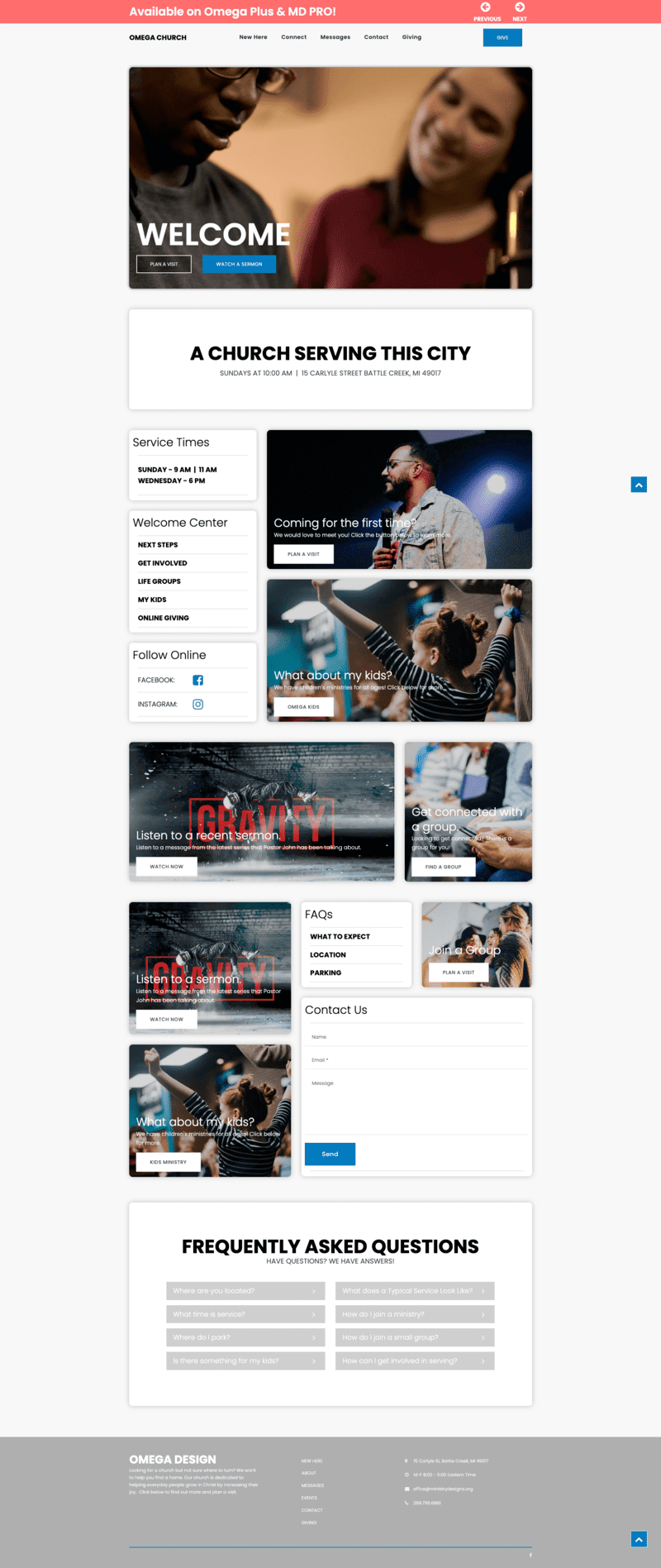
Are you looking for greater control over the aesthetics and overall placement of different elements on your site? Does your website need a unique look and feel to stay on brand with your organization? Well, look no further than the Modular Design kit. It is the ideal template for churches that want tighter control over the website design without having to result to coding.
The template has different options for every design element you might want to use. It comes with varying designs of Call to Action Cards. You can use the larger cards combined with a right or left alignment for a prominent CTA. This gives the CTA a more prominent attention-grabbing look that is ideal for one or two CTAs. On the other hand, if you have a large number of CTAs, the smaller cards are perfect. They'll showcase information at a glance, whether arranged in a grid or tile design.
Another modular design element that churches can play around with is the FAQ block. You have a choice of two visually distinct designs to use. You can use the small FAQ block for a more discrete look. Alternatively, you could use the larger block that is easier to find and use.
On the menu front, you can choose three different types of menus – the main header menu, the side menu, and the footer menu. You could use the header menu for a traditional look and intuitive user experience. You can also choose to use a sidebar menu as the main navigational menu or a secondary menu.
When used as a secondary, the side menu offer the perfect solution to complement the header menu by navigating the traffic to specific pages of interest to users. Including a sidebar menu creates an opportunity to add social media buttons on the sidebar and informational cards. As for the footer menu, you can combine it with the main and side menus to enhance the navigational experience your website gives users.
Aside from design flexibility, the Modular Design kit is designed to tick all SEO boxes. It is speed-optimized, lightweight, cross-platform and cross-browser compatible, responsive, accessible, and functional.
Church Website Template | Kit 6 | Smooth & Dynamic
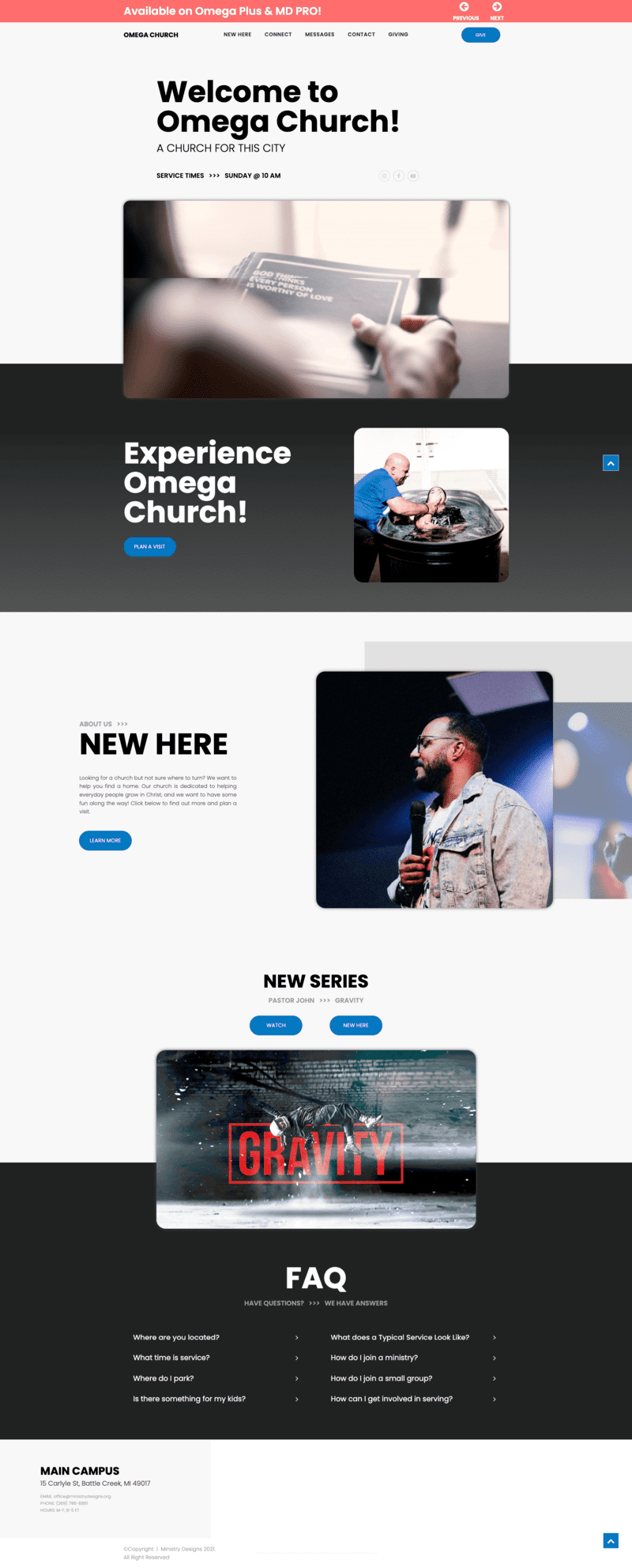
The smooth & Dynamic kit is dominated by a visual experience. The homepage illustrates the focus on the visual experience of this site. For instance, the homepage's above-fold section of the template is an eye-catching heading and image, GIF, or video slider. Nonetheless, website owners can sprinkle additional information and features in this section. The website template, as downloaded from the Omega website builder, includes social media buttons in the above fold section.
Full-width CTA sections with an embedded image follow the above-fold feature image. You can customize these sections by aligning the images across the two or three CTA sections to one side or different sides of alignment. Additionally, you can add a few sentences in the CTA to enhance the click-through rate.
Below the CTA is the FAQs. Like the visual CTA, the FAQ is a full-width feature that allows churches to proactively answer the most popular common questions they receive. Finally, the footer section is designed with a map iframe. It will enable you to embed a Google of your church location. It also accommodates the name, address, and phone number for NAP optimization. You can customize this kit further using blocks and features in the Omega Designs marketplace.
On the website navigation front, the template uses a header menu on the homepage. Other pages across the template also have a header and footer menu for convenience while exploring the church website. The CTA also provides a more customized navigation experience. Churches can use the homepage CTA to direct users to specific pages.
On the SEO front, the Smooth & Dynamic template is optimized to rank well on search engines. For instance, the template is responsive, fast, and NAP-optimized. Additionally, website owners can use Omega Designs' SEO tools to optimize their church websites further.
Church Website Template | Kit 7 | Built to Convert

The Built to Convert kit is designed with conversion traffic to church members in mind. To this end, the template structure is designed to concisely convey as much information as possible with a keen interest in attracting new church members to the site and the church's physical location.
For instance, the above fold of the homepage is dominated by a background video and a foreground H1 and H2 followed by a CTA. Website owners can easily customize this section to attract new church members.
For instance, they can customize the background video to show the look and feel of their churches, giving website users a visual experience of visiting and communing in the church. Additionally, churches can use the CTA to direct users to the parts of the site that explain where the church is located and when to visit.
The conversion optimization extends to the body of the website as well. Once you scroll down the homepage, the main feature is a hero section structured in a row. Churches can customize this section to explain a little more about their organization and provide details about different aspects and/or services they offer.
The church website template also features a prominent FAQ section. As is the case with other kits, the FAQ allows churches to provide answers to the frequent questions they receive. Footer is populated with a secondary menu and an SEO-optimized section for the NAP.
To further enhance the ability of the church to reach out to potential new members, the site is inherently optimized to rank well. For instance, the template is lightweight and speedy even when you consider the featured video in the above-fold. It also offers an excellent user experience, encouraging users to interact with the website. When paired with fantastic content, churches can optimize the conversion of online traffic to church members.
Church Website Template | Kit 8 | Flashy & Unique

The Flashy & Unique kit has a youthful look and feel while still meeting the needs of churches that use the kit in creating their website. For instance, the homepage or front page is designed to take advantage of video content captivating and easy message delivery. While you can incorporate text blocks to enhance your messaging, video and images are the focal point and means of the church templates communicating with users.
For instance, the homepage has an embedded video in the above fold, followed by an image tile that visually represents your church. At a glance, website users can visually place themselves in the church. The prominent use of multimedia is beneficial to churches targeting a youthful congregation.
However, the focus on using multimedia does not compromise functionality. The church template uses an intuitive header and in-page menu to navigate church website users to the right parts of the site. Additionally, the template uses a NAP-optimized footer with an embedded map for location identification. It also incorporates an FAQ block on the home page.
On the SEO front, the church template ticks many of the fundamental SEO boxes. It is optimized to pass Google's page experience, core web vitals, and mobile usability. As with all other church templates, the Flashy & Unique helps you rank well on search engines, helping your church create an effective presence on the web.
Church Website Template | Kit 9 | Classic Made New
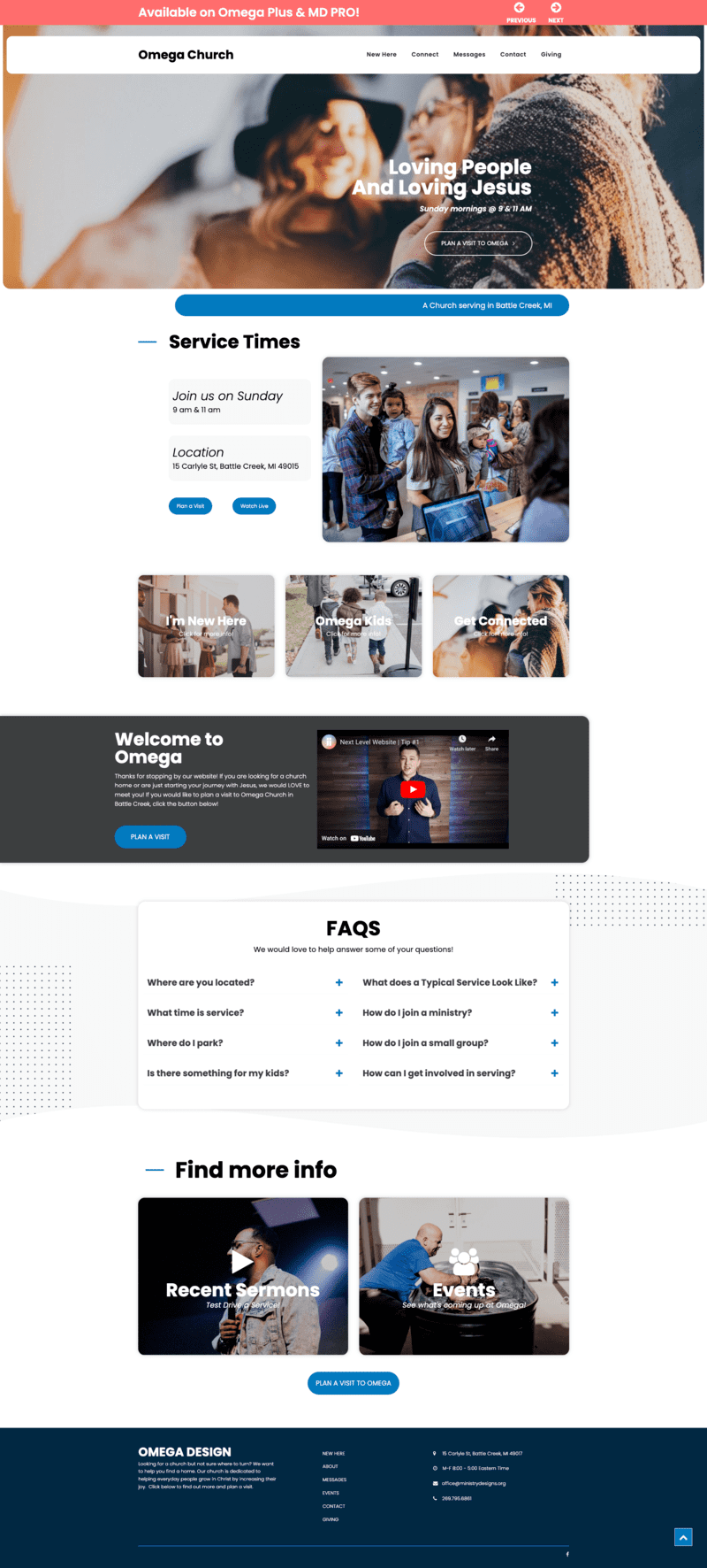
There are plenty of ways to present your church through a website. Some are more effective than others. However, you can never go wrong with a classic look. The Classic Made New is a modern take on traditional website aesthetics. Everything is clear and straightforward. Every feature is placed where you'd expect to find it. However, the church template has several new features that elevate the website's functionality and meet users' expectations in the modern era.
For instance, it has an embedded image or video header to introduce the website users to the church. The large font H1 imposed on the header and the header menu gives users a brief introduction of what they should expect as they explore the website and learn more about the church.
A hero section with a clear call-to-action helps direct users to the necessary information. Additionally, this church website template has space for a YouTube video embed, which allows churches to tell the audience about their organization. On the SEO front, embedding a YouTube video on the homepage helps the website rank well on Google's search engine results pages (SERPs). The FAQ block allows churches to optimize their website to perform well on the 'People Also Ask' section of SERPs and it has a powerful events calendar!
How Useful It Is To Be Able To Switch Between Church Website Templates
The capability to seamlessly switch between different church templates of the same website builder and theme cannot be understated. It adds to the inherent versatility and flexibility of the theme's design library. Consequently, web designers and owners combine the church templates with the website builder's design library to create a website that perfectly suits their branding guidelines and specifications, no matter how specific.
Additionally, the ample choice of templates makes it easy for churches to build websites that meet their design needs. Importantly, they can create websites by dragging and dropping elements without coding. With the ability to switch between 9 church templates, website owners can easily find a web design that meets their needs without having to do any coding or heavy coding.
Equally, the ability to switch between church templates makes it easy for churches to update the aesthetics of their site without straying too far from the original design. This means the website owner can update their website quickly, giving it a new look and feel with just a few clicks of buttons. Whether you're changing the website's design to reflect a season (such as the Christmas season) or changing the design to reflect changes in branding, you can achieve your goal in a few minutes.
The libraries and applications are universal across all of the 9 kits. You can effectively switch between the Omega Designs Church Website Templates without losing any functionality that you've implemented on our website. As you can appreciate, changing the look and feel of your site using the Omega by Ministry Design is easy and convenient as you never lose any of your site's core functionality.
Finally, using this website builder makes for a cost-effective experience. Upon purchasing the website builder, you can use any templates to build your site. Additionally, you can use the Omega cloud marketplace to access free custom-designed pages and blocks to customize your website at a truly affordable price, making Omega, its church websites, and access to the best church website templates truly the best option for your church.

