Site Builder
Highlighted Features
Pages & Blocks
Build and customize your church's website easier than ever
Small Groups Manager
Connect with believers through Bible study and fellowship
Holiday Bundles
Save time preparing for your biggest services of the year
Sermons Manager
Watch, listen, and share inspiring biblical messages
Events Manager
Stay updated on church gatherings and special occasions
Online Giving
Enable secure and convenient donations for your church
Use Case
Next Steps Framework
What makes Ministry Designs different? Find out here
More Website Visitors
A church website is only as good as its flow of traffic
More Sunday Visitors
An effective website will help drive visitors to your church
More Community
Encourage more connections weekly through your website
More Engagement
Your website should be the central hub for all church activity
More Small Group Attendance
Small groups made clear, accessible, and easy
Increased Visitor Engagement
Make it simple, point new visitors to your website
More Efficiency
Intentional communication leads to higher efficiency

Is your church website doing its job?
Have you ever defined what that job is?
In this comprehensive guide, we’re going to do all of that and much more!
Leading a church is an involved activity. It doesn’t matter if you’re operating a tiny, rural non-denominational ministry or an urban mega-church with a dozen campuses. Church leadership is always up to its eyeballs with things to do.
With so much going on, it can be hard to give much heed to a lowly church website. After all, your attention is soaked up with everything from counseling to caretaking, ministries to messages, prayer to payroll. Throwing in the need to create a website — and a site with little-to-no tangible benefits (on the surface at least) can feel like just another item on an infinite to-do list.
But I’m here today to challenge that notion. That’s right, it’s time to stop seeing your website as a problem. Instead, you need to look at your church’s website as a valuable asset to your organization.
Let’s start this transformation by considering what a website is — I know, it sounds obvious, but when you break it down it can be quite revealing. From there, we’ll consider how a good site can help any church, great or small.
I also want you to be able to walk away from this resource with an utterly thorough understanding of how to design and maintain a good website (you’ll learn more about what this means, keep reading).
Again, this isn’t a straightforward, formulaic concept if only because of the vast diversity of needs from one ministry to the next.
Nevertheless, I’ve provided a comprehensive breakdown of the many various factors that you can and should consider adding to your church’s website. After that, we’ll briefly run over some of the ways that you can promote your site to ensure that it’s fulfilling its purpose as a valuable asset for your ministry.
Now, this is a very large resource, and I’m aware that pastors and church leaders rarely have time to sit down and consume huge quantities of information. If you don’t plan on reading through the entire guide (or you’re doing so in chunks), that’s perfectly understandable. I’ve provided an easy navigation guide below to help you jump to the spot that you’re interested in reading next.
Regardless, I would strongly encourage you to spend time and reflect on your current website.
I want you to learn from my 15 years of experience…
Over that 15 years, my team and I have produced thousands of church websites and this guide is a culmination of everything that we’ve learned.
So here is what we're are going to do...
We're going to start by taking a look at the 21 of the best church websites, I'll explain why they are on the list, and then finally we'll talk about how you can do the same thing with your church site.
We've a church website framework call "Alpha" meaning the following four things are the most critical any church website project.
We'll dive in a bit deeper later on in the article, but for now you need to know that the Alpha church website framework consists of the following parts and comes native with our church website builder, Omega.
- Discover - People need to find your church online.
- Like - They need to like who you are as an organizaition
- Trust - They need to trust you!
- Engage - AFTER those three things happen they will engage with you.
Let’s dive in...
Church Website Builder
Most of the following website or built on Omage by Ministry Designs. If you're looking for the worlds most powerful church website builder click the button blow to learn more.
New Life Rehoboth Church
Church in The Bronx, NY
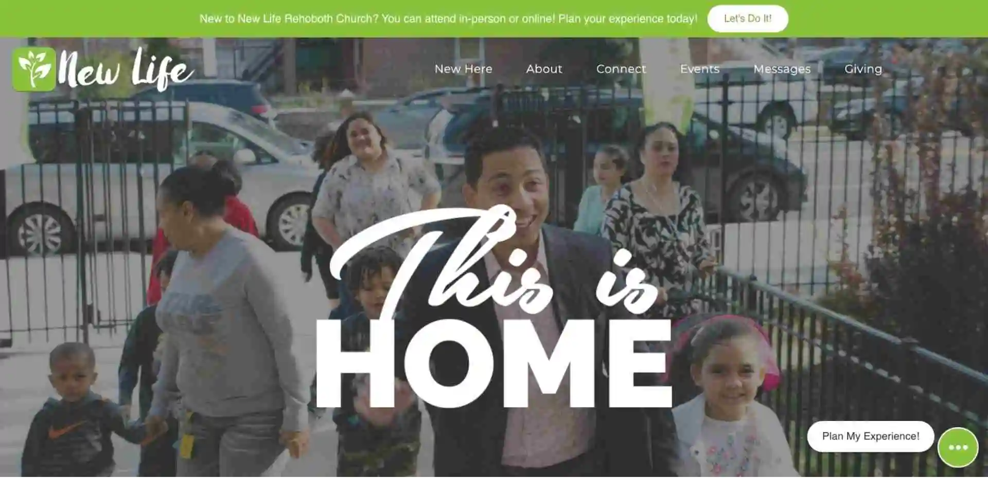
Alright, we are in the Discover phase of the Discover, Like, Trust and Engage Alpha Church Website framework, and we're going to take a look at New Life's website, which is a church in the Bronx, New York. New Life is an Omega user and one of the things that we really like to focus on in our website technology is search engine optimization. From a technical side is your website going to be sound and we built that natively to our website builder. Because of some of the stuff that we had built-in on the back end, a lot of the churches that we work with have the ability to rank higher than some for some pretty competitive terms.
Church in the Bronx happens to be one of them. This is New Life Church, and you know they've got an Omega design. It's very logical with one of those panel-based designs like we've been talking about. It's really well done but the most critical thing that they've done here is they've optimized their search for Church in the Bronx and you can see here that they are the number two… uh right here, I'm sorry, the number two spot for the search term “Church in the Bronx” which gets about 390 to potentially 400 searches a month. In talking to pastor Antonio, he's been able to see a significant amount of new visitors because of his search engine rankings and so we really focus on Discover and especially Discover in the search engines.
The reality is that 90% of local website traffic still comes from Google, which means if you're irrelevant to Google, meaning you're not on the first page, you're basically not going to get found. So it's critical when we say Discover that you optimize your website from a search engine's perspective. This is a highlight of that and this is going to be a theme throughout the rest of this particular phase because I believe that search engine optimization is one of the most critical fundamental things that you can do as a church.
South CLT Pres Church
Church in Charlotte
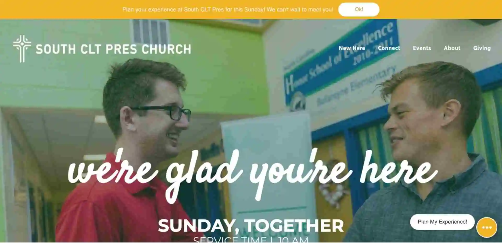
Alright, well hey, we are continuing our series on the Alpha Church Website Framework and today we're talking about the Discover phase of that framework. Again, every one of these principles is absolutely critical to making sure that your church website works effectively. This website right here is one of the best examples that I have of that. So we're looking at South Press Church, and they are a church in Charlotte, North Carolina.
It's funny because you know, search engine optimization is one of those things that as you monitor it, you'll notice that your website kind of bounces up and down and it goes from maybe spot three to spot six, back up to spot two. It kind of moves around a little bit but at one point last week, I was taking a look at the SEO results for the search term “church in Charlotte'' which has about 18,000 searches a month.
Now this is a newer customer to us and they're on our Omega framework or my website builder, and they've got a few hundred people in their church on a good Sunday but they were outranking Elevation church for the longest time which happens to be one of the largest churches in America with Steven Furtick as their senior pastor. Now, if you search the term “church in Charlotte,” they'll show up as four or five. Right now, they're position number five. Oftentimes, they've been as high as position two and so they just kind of bounce around a little bit. Today they're in position five but for the search term “church in Charlotte” with 18,000 searches a month. Meaning that's 18,000 people looking for a church in Charlotte, and South Prez has an opportunity to start a relationship with those people because of that.
That's why the search engine optimization thing or the Discover phase of the Alpha Church Website Framework is so critical because if you don't get that right, you're missing an opportunity to start a conversation with 18,000 people in your community. Now obviously, if your community is smaller there are potentially fewer search terms like the rest of the videos that we've talked about in this phase. But the reality is if you search, or you know everybody is searching for a church in a city, your church has to show up.
That is a basic 101 from a Discovery perspective so congrats to South Prez in Charlotte North Carolina. Congratulations on being able to be on the first page of such a highly searched search term! If you have specific questions about search engine optimization my team would love to help! There's a button at the bottom of our website on the right-hand side that says “Help.” Go ahead and chat with us and we'd love to answer any questions that you have!
Christ Alive Church
Church in Battle Creek
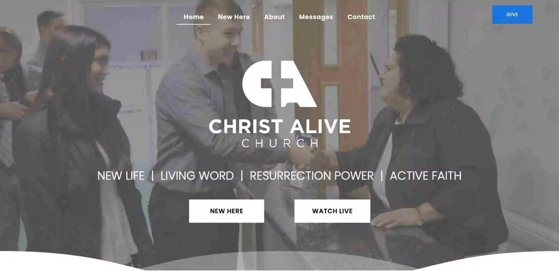
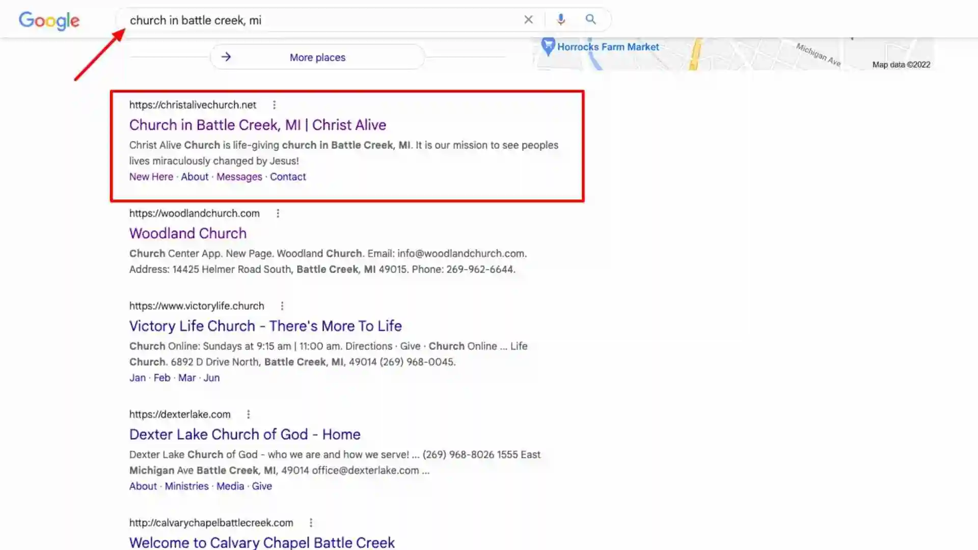
Alright, well hey, we are in the Discover phase of our Discover, Like, Trust, and Engage Alpha Church Website framework at Ministry Designs. We call that the Alpha framework to go along with our Omega website builder. I'm excited to tell you about Christ's Life Church Christ Alive Church is a church in my hometown. One of our team members here at Ministry Designs is a member of the church and so they've been helping them with optimizing their website since it's a smaller church in town. There are actually some larger churches in the area as well so there's a couple of churches with a few thousand people in them. If you search the term “church in Battle Creek,” this small little country church shows up as number one for that particular church. Sherman, and at one point, Woodland Church was at about 3,500 people and Victory Life is probably close to between 1,500 and 2,500 people if I had to guess, and so it's relatively large which means there's some competition there.
Now Christ Alive Church has just done an incredible job of optimizing for this particular term and it's because they were able to go over to ubersuggest and realized “Oh, hey, this search term church of Battle Creek has 390 searches a month and the SEO difficulty on that is six which means nobody is competing for this term,” it's a really easy term for us to just own and win. Because of that, they've been able to see new families and new visitors come to their church every single week.
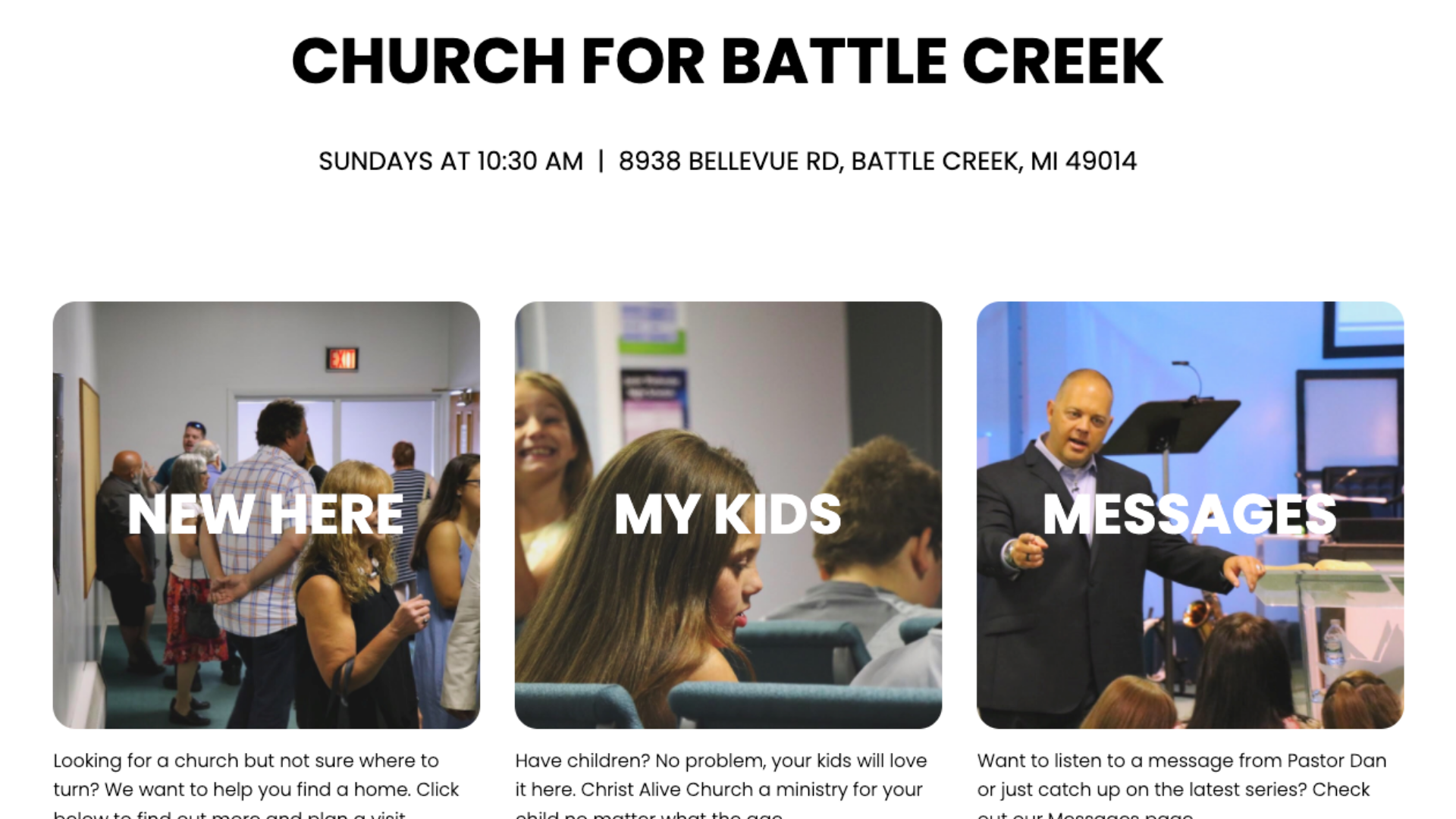
90% of local website traffic comes from search engines. So they have a New Here page, My Kids, this page, then they talk about all of the other things that we talk about from a Discover, Like, Trust, and Engage component. They've got a Plan and a Visit button, now it's one of those things where man, they're just really kind of taking this framework and they've been able to use it to grow their church! It starts with Discover and if your search is not sure, your church is not going to be showing up on the search engines. You really need to evaluate, man, how are we going to take in and take advantage of the opportunity for all of this free traffic?
Brew City Church
Church in Milwaukee
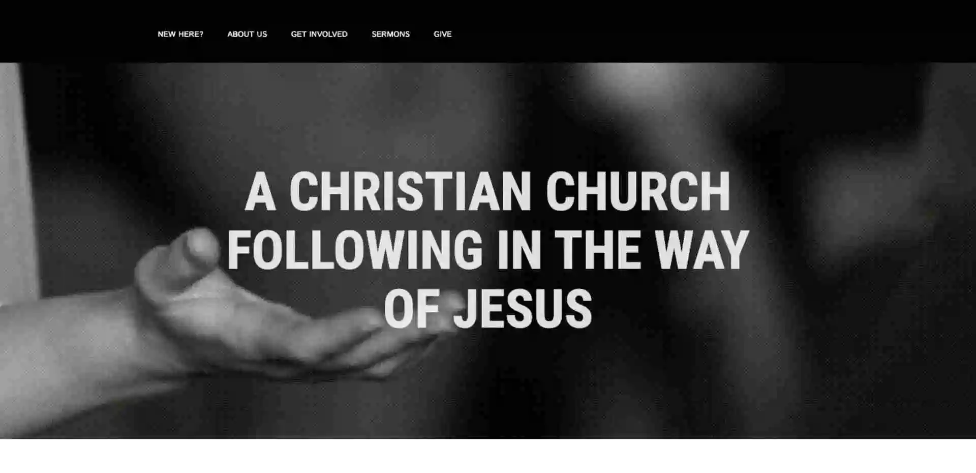
Alright, well hey, we have been just talking about the Discover, Like, Trust, and Engage framework that we here at Ministry Designs called the Alpha framework to go along with our Omega website design-builder. Today, we're going to take a look at Bruce City Church. Bruce City is basically a neighborhood in Milwaukee, which is obviously a larger area, and Bruce City has optimized for not only “church in Bruce City” but they've also optimized their website through the help of our team for “church in Milwaukee.”
Now, this particular search term has 800 searches a month. It's got a pretty difficult SEO score and the reason for that is because there are a number of large churches in Milwaukee. If you take a look at the search page, Eastbrook and Elmbrook are in there but the reality is if you search “church in Milwaukee,” you're gonna find this little neighborhood church called Brew City Church and it is optimized for the search term “church in Milwaukee.” As a result, Brew City Church has been able to grow its congregation significantly. When somebody is moving to the Milwaukee area, and they search for the search term “church in Milwaukee” they are going to find Brew City Church.
When we onboarded Brew City Church as a customer, they were a smaller congregation since they were just a newer church plant. But we were able to help them optimize and they've been able to grow significantly because of that! When we talk about Discover, Like, Trust, and Engage, it's critical you do it in that order. People have to be able to discover you, that means to find you on the search engines, then they have to like you, then they have to trust you, and then at that point they'll be willing to engage with you. Bruce City is a good example of that. If you have questions about search engine optimization, there's a little button at the bottom of our screen that says “Help” so give us a chat and we would love to help answer any questions that you have!
Asbury Church
Church in Raleigh

Well hey, we're going to take a look at Asbury Church in Raleigh, North Carolina and we are currently talking about the Discover phase of the Discover, Like, Trust, and Engage church website framework that we here at Ministry Designs like to call the Alpha framework to go along with our Omega church website builder. Asbury Church is also a Ministry Designs customer and they're in Raleigh, which you know has a relatively competitive market, or at least it has a lot of search volume. Now there is not actually a lot of difficulty, meaning that there are not a lot of people, not a lot of churches optimizing for this term. In fact, that's one of the things that I love most about search engine optimization for churches. If you're a church leader watching this right now, you have to take search engine optimization seriously because not a lot of churches are doing it and it gives you an opportunity for an easy win.
If you have questions, we have trainings, we have resources, and we would love to help you with this particular part of the Discover, Like, Trust, and Engage framework. Go ahead and chat with somebody from my team and we'd be happy to help you out. Now, this particular search term has 1,900 searches a month and this relatively small church, Asbury Church, they're currently sitting in position number six for this search term. Literally, any church could do this. I mean there are a number of really large churches in Raleigh and yet, Asbury Church happens to be outranking a lot of them. They're for sure on the first page, they're for sure seeing traffic, they're for sure seeing new visitors because of their search engine location.
So hey, thank you for taking a look at the Discover phase of the Discover, Like, Trust, and Engage framework we here at Ministry Designs like to call the Alpha Church website framework to go along with our Omega church website builder. If you have any questions feel free to chat with us, we would love to help.
3Circle Church
Church in Alabama
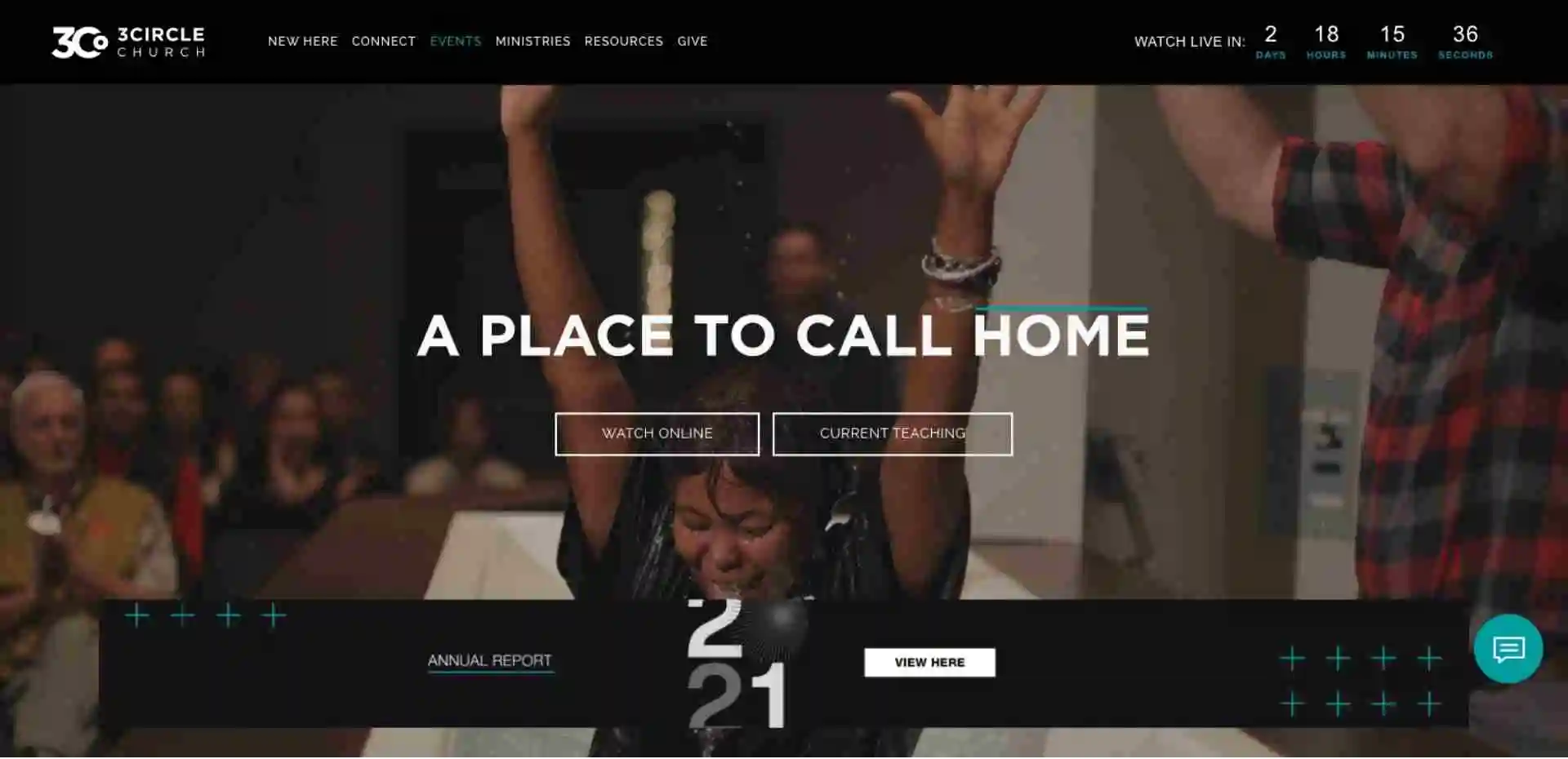
Alright, well hey, we are here with another video example of what a church website requires to be Likable. Again, the Likable phase of the Alpha framework is really directly tied with modern design. This particular website example 3C, which is Three Circle Church, has just done an incredible job of really illustrating who they are as an organization. They've got a lot of different things going on on their particular homepage and I just want to quickly walk through those with you real quick to kind of point out what makes sense and what doesn't make sense.
So “A Place to Call Home,” you can see that they're a multicultural church just through the scrolling images. One of the things that's unique about this particular site is they're actually still using a scrolling banner. In a general sense, you don't want to use a scrolling banner anymore except for in this specific case. The reason for that is because the words, you'll notice, aren't changing “A Place to Call Home.” The call to action is not changing since those are consistent. With the banner changing, this is more so just giving you an impression as to who they are, and they're doing it without video. They've done a really good job of this as we scroll down beyond the feed, or beyond the fold, you'll notice just really well-crafted graphics that really illustrate “Hey, we take design seriously.” This is a unique touch that has an overlay there that is unique, but it also allows you to just kind of scroll through some basic information. Small groups, memberships, baptisms, and serve, these are all like the core things that they want you to find on their website. They've done a really good job of laying those out in a way that's visually appealing. A place for your family, they're highlighting the fact that their family is important. They illustrate a family behind it and then they give you the options to navigate to these specific locations on their website. This is really well laid out and very logical and you'll notice, just overall, it's a clean website easy to navigate. Easy on the eyes, there's not too much clutter, it's not very overwhelming, and so I give this particular site an 8 out of 10 from a grading perspective on likability. Somebody's going to visit the site and instantly be attracted to it because it's clean, consistent, and easy on the eyes.
Bayside Church

Alright, hey, we are still in the Like phase of the Alpha church website framework and in this video, we're going to be taking a look at Bayside Church. Listen, I love what Bayside Church has done from a design perspective. They're really using this new kind of “modular” model of content organization and it's a real modern-feeling look which was essentially popularized by Elevation who did it first and then New Spring has also done it.
Also, it's available as a homepage design in our Omega website technology so if you have questions about that, feel free to reach out to my team, but it's really a kind of a modular approach to displaying your content. One reason that I like it is that it's very logical and thought through but the thing that I like most about it is that it just responds perfectly if you're looking at this on a mobile device. This is the most logical thing that you can encounter from a website that is responsive but not mobile-first. Essentially, it feels like it's mobile-first but it is perfectly laid out for desktop and mobile devices. Bayside has done an incredible job of organizing their content making it easy to navigate and not really overdoing it with that concept. It's just a well-thought-out, well-organized site, and so they are a good example. Again, if you just want the easy button for this just go ahead and create an account with Omega and you can deploy this kind of layout in just a matter of seconds.
Citizens Church
Church in Sacramento

Alright, in this quick video we're going to be talking about Citizens Church. We're still in the Like phase of the Discover, Like, Trust, and Engage church website Alpha framework, and the reason that we're doing this is that I'm really just trying to give you context for your design. A subjective, good design has principles it is based on, but what is palatable to an individual can look different. So I want to really highlight what good principles are so that you're understanding when you're deploying this on your website. Now, the reason that I like this particular website is that it's extremely modern. Citizens Church is actually a Ministry Designs customer, and this is a website built on the Omega platform. They've just done an incredible job with laying out their information and kind of leading you through this almost disruptive-looking design style.
Pastor Sean has done an incredible job creating this website and making it fit who they are as an organization. Likability happens when a website creates a statement and this website is going to identify with people, especially the specific group of people that they're trying to reach. They've tailored it perfectly to that group and it also responds beautifully. Now this isn't one of those panel designs like we were talking about and I've shown in other examples however, it's still perfectly responsive which means it looks flawless on a mobile device. We're super happy with this one conceptually because it is a really well-designed website that responds perfectly. So, kudos to Citizens Church!
Evangel Church
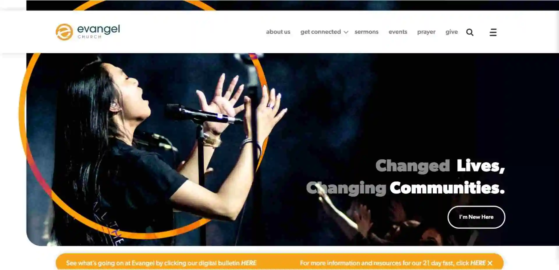
Now from an aesthetics and a design perspective, I absolutely love the Evangel Church website so we're going to continue our series in the Likability phase of the Alpha Church website framework and we're just going to spend a little bit of time looking at Evangel. In the last episode, we talked about the “hero image” or the “banner image” which is the first impression that somebody gets when they land on your website. Evangel has done the exact same thing as the last church has done and they've perfectly articulated who they are as a church through imagery. Good design happens on the church website through multiple things and that's consistent spacing but it also happens primarily through art and imagery and photography and videography. When you're producing this content, you want to make sure that you're producing it in a way that allows people to understand who you are as a church without a doubt because you don't ever want to misrepresent who you are as a church. The last thing that we want somebody to do is to go through this entire process of discovering you, liking you, trusting you, then engaging with you and showing up on a Sunday morning only to realize that they've been duped. That would not only destroy your potential for building a long-term relationship with that individual, but it would also prevent other churches potentially from building a long-term relationship with that individual. It's critical that we get this imagery right.
Now, as we navigate through their site it's just so logical. Service times, new to the faith, new to the church, join a life group; this is a progression of relational understanding. The person that's doing the website asks, “Are they new to the faith? Okay, we have a path for you. Oh, well, you're not new to the faith but you might be new to the church? Okay, we have a path for that. Okay, now let's take the next logical step and get you deeper connected right and then. How do we engage with you about what's happening in the church?” I mean it's just so well done and it's got this modular feel that's just going to respond flawlessly to a mobile device so I would really spend some time looking at the Evangel Church website
Now, there are some things that I think that they could do a little bit better in the other phases again but from aesthetics, design, and a likability perspective, as we're talking about this Alpha Church Framework. This church website has done a flawless job with its homepage and creating something that's aesthetically not only pleasing but desirable. You just want to spend more time here because they've done such a great job.
Fairhaven Church

Alright, now here is an example of a beautifully designed website but they missed the mark in other phases of the framework. From an aesthetics perspective, they've done a really good job of saying, “We understand modern design elements!” In fact, this website almost feels like a software company's website a little bit with the iconography and things like that. Fairhaven.church is the URL and I'm just going to scroll through it a little bit and just kind of show you how pretty it is and then I'm going to talk a little bit about some of the things that don't necessarily make sense. It's just a little bit difficult to navigate and some of the buttons and things like that don't work. What happens is it breaks down opportunities for you to build trust. Like, “Oh, I should click on this button” and it doesn't do anything. I don't really know where to go from this homepage. I'm not really sure what it is they want me to do. There's nothing clickable here. This is a cool little gif, but you click on it and it doesn't go anywhere.
Okay, so they want me to watch their series. I'm new here, but you've done nothing as a church to get me to engage in that process. Now again, from an aesthetics perspective and the likability perspective, you've grabbed my attention but then you've lost it as we move into the trust phase because I don't know where you want me to go. Now, if I try to navigate to a specific campus here, nothing happens. Nothing changes. I mean this changes, but their home page is the exact same so for me to find my location I actually have to go down here to locations and think about it and kind of think through the process of like “Oh, where else can I find the Centerville campus?” Well again, it's beautifully designed. I absolutely love the way that they've thought through this, they just need to fix a couple of potential things to create that trust that we're going for in the next phase of the alpha framework. Again, iconography is flawless, spacing is flawless, typography is flawless, well-done color scheme, beautiful imagery, it’s great.
I know who you are trying to reach but there are not a lot of next steps. From a trust perspective, a kid's play area is a great thing for kids but it needs to really articulate to parents that, ‘Hey, we have CPR certified volunteers and we have a safety protocol in place, God forbid, something horrific happens. We have a fire escape plan. We have thought through the things that really matter to you as a parent. Yeah, your kids are going to come here and have fun but are they going to be safe, and they are going to learn about Jesus.” When I'm looking for a church in all of my various travels, when we visit churches around the country, play places are cool and all but are they going to learn about Jesus? So we want to make sure that we're highlighting those types of things.
Grace Family Church
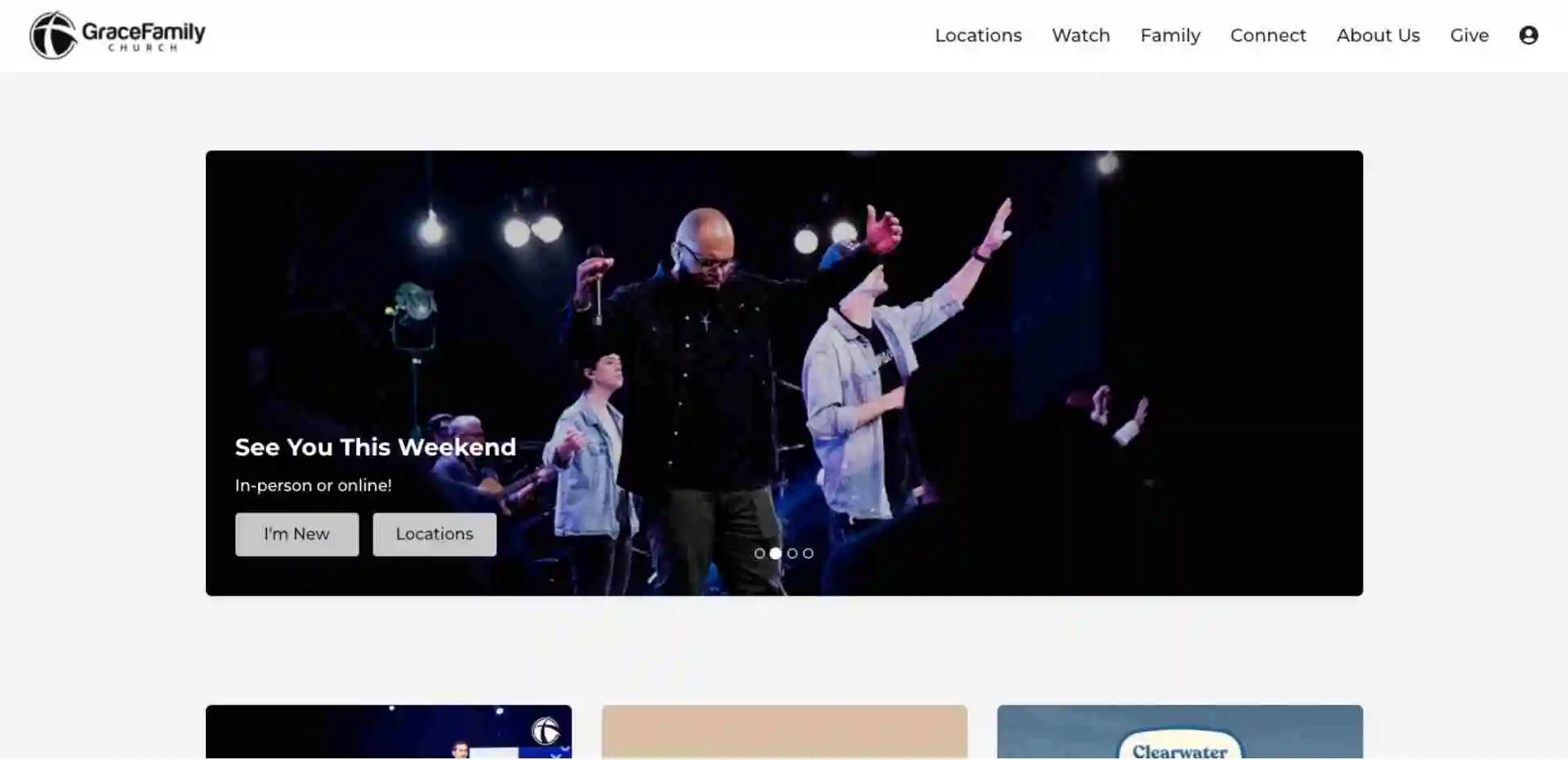
Well, hey there everybody, we are back with some more examples about the Likability of websites and what makes them likable in the Alpha Church website framework. Grace Family Church is another good example of just clean unified design. It's very logical to navigate, it's pretty modular like we've been talking about, but they use these panel designs. In my opinion, these can be a good thing or a bad thing depending on how they're used or what you're trying to accomplish on your website. These seem to be pretty well laid out and organized in a way that would be intuitive for a first-time visitor. Ministries are obviously important, events, groups, do you want to get involved, but it's like, “Hey, here's a home page and then you can spider out from there.” It's pretty basic, pretty clean, the imagery is well done, the fonts are consistent, it's really a good example of clean, real, straightforward design.
Lifepoint Church
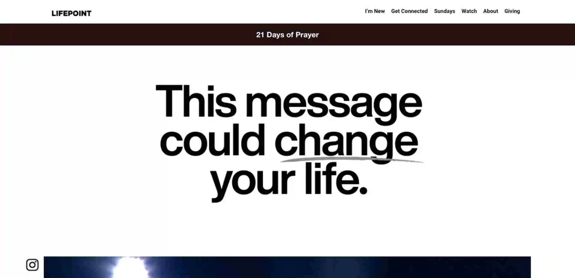
Alright, we are back with another example of a Likable website for the Alpha Church website framework. Lifepoint has just done an incredible job of just helping you understand exactly what they want you to know right on the front end. “Hey, this message could change your life.” Okay, let's watch the message. It's very straightforward, very basic, very intuitive, and you know exactly what you're getting in a matter of seconds. This is a principle that is critical to the like phase of the Alpha framework which is Discover, Like, Trust, and Engage. The reason that it's so critical is that you only have a split second to grab somebody's attention. Now if you ask me, they have done a flawless job in that “this message could change your life.” Okay, well that's pretty interesting, I think I'm going to stick around and see what the rest of this website has to say.
Now, this happens in a matter of seconds, and the reason that it's important to understand that is because people automatically associate their first experience with you and then they apply it to the rest of the relationship. So this is really your first impression. I know that we've been talking about that and if you've been around church communications for a long time, you understand that your website is really your first impression. The reality is if you don't make this first impression perfect, you're not going to get an opportunity to build trust with them or get them to engage with you in the future. When I say “them” I mean potential first-time visitors to your website and Lifepoint has just done a perfect job of this. The spacing on everything is perfect, the font types are consistent, the titles are consistent, “become fully alive in Christ” this is very straightforward, very easy to understand what they want you to accomplish, and easy to navigate. So there are some things that they could do better in the other phases of the Alpha framework but in my opinion, this is one of the better examples that we have looked at.
Liquid Church
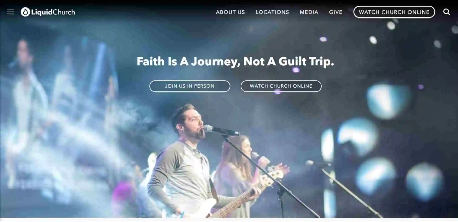
Alright, welcome back to the Like series in the Alpha Church website framework, today we're going to be taking a look at Liquid Church. Now, one of the things that I like most about the Liquid Church website is this banner image. You see that you can just come however you're dressed and that there's nothing fancy required. They've done a really good job at describing to you in their photography that they're a church that probably has modern worship and really it's kind of a “come as you are” type of church. You're able to see all of that in this image and that other portion of the website isn't critical, but the hero section of the website is critical because that main banner people open up and see or potentially a video is really the thing that's going to speak to them most. It's above the fold which means they don't have to scroll anywhere, and what it does is it just communicates exactly who you are. Just like the age-old adage goes “a picture is worth a thousand words” this picture right here is definitely worth a thousand words. You must get that imagery right because you want that to be a perfect representation of your church. As soon as somebody sees it, it allows them to understand who they're dealing with. Then immediately based on what they see, they'll start the process of deciding whether or not you're going to be a good fit for them.
Now we've been working with churches for years and years and we did a survey not too long ago about “what are some of the common things that people look for on a church website?” One of the single most asked questions is “what do I wear?” Now, in this particular image, you find out exactly what to wear but I think what people are ultimately asking is a little bit more than “what do I wear?” It's “will I fit in?” or “I want to make sure that if I come and visit, I'm going to fit in.” Now, you don't want to show up to church on a Sunday morning in a suit and tie if the people on stage are going to be dressed in casual clothes right? Or vice versa, you certainly don't want to dress up or wear your ball cap and shorts if the people on stage are going to be in a suit and tie. You want to provide that imagery to the first-time visitor of your website immediately. I know I have spent a lot of time here in the hero section but it's critical that you get that.
They've done a phenomenal job with the rest of their site. This modular style is really something that I want you to pay attention to. It just responds so perfectly on the phone and it almost feels like native to a mobile device. You can still effectively communicate the information on a desktop but when you look at it on a mobile device, it looks like it was natively designed for that. They've just done an incredible job with this so I would dig into liquidchurch.com to find out exactly how you can recreate some of these principles on your site in order to go ahead and start taking steps to improve your site design.
Bayside Community Church

Alright, in this particular video in the Like phase of the Alpha Church website framework we're going to be looking at Bayside Community Church. The reason that I like what they've done from a Like or design perspective on their website is they've done an incredible job with their color palette. I think that it's just this shade of blue is really inviting and everything is spaced really well. It's very clean, very logical, and very simple. When you visit this website you won't be overwhelmed. You immediately know what they want you to do by clicking “in person” or “watch online.”
This is kind of a resource section that they've created and then some quick links. This is the modular perspective that we were talking about in the last website example. This is another good example of that. Now with that being said, this doesn't respond quite as well. It is still panel-based, which is what you'd be used to seeing in an app, and it's very well organized. You get these quick links first thing to make it easy without having to click on any kind of navigation. They know where they want you to go on the website.
So kudos to mybayside.church! They've done an incredible job. Keep in mind the color palettes, the modular design of the homepage, which really is kind of where your website should be headed. If your website is not already in this kind of modular way of thinking, you're really missing an opportunity from a mobile responsive perspective.
Definition Church
Church in Greensboro
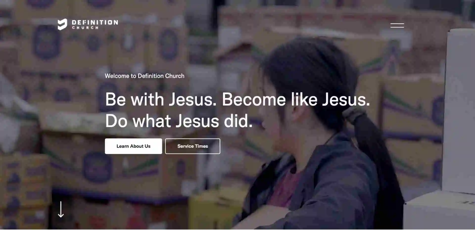
Alright, here we are in the Trust phase of the Alpha Church website framework and again this entire process looks like; somebody needs to discover you, then they need to like you, and then they need to trust you, so how are we building trust? That's kind of what we're thinking about on each one of these website examples. Definition Church has done a good job here by having a “learn about us” button. It's become one of the two core things that we are seeing when we're presented with this website, “learn about us and service times.”
Having a “learn about us” page is critical because people in a study that we did not long ago said that there are some critical things that people are looking for on a church website and a learn about us section is a good place to put that information. “What do I wear? Are my kids going to be well taken care of? Do you have a plan for me? Do I relate with the pastor and the people in the congregation? Can I identify with the topics that are being discussed?” These are all things that we want somebody to get the answers to so that they feel comfortable joining us in person. This particular church does a really good job with that. They highlight next-generation, kids, youth, young adults, that's obviously important and they've got a plan for that. They call this thing “The Core” which is basically taking the next step in their relationship with the church and then they've got all of these useful links online. Join a community, request prayer, get involved, all of these things help build trust. Now, I do think that we can take this a step further because what we need to do is we want to be proactive about answering these questions. What they've done is they've thought about the questions but they haven't necessarily gone as far to be proactive about answering them.
Evangel Church

Alright, well here we are back in phase number three, the Trust phase of the Alpha Church website framework. The Trust phase is actually one of the most difficult phases to achieve because we have to be forward-thinking as church leaders. We have to actually think about who our congregation is, this is our demographic, this is where we're headed as a church, so what are the questions being asked? What kind of questions are the people that we're going to attract have for us if they're ever going to join us in person? And to be perfectly honest with you, it's hard to find really good examples of this. I think it's one of the most critical things that we here at Ministry Designs help churches think through because the fact is, there are so many barriers to joining something in person. You have to really think through them and ask yourself “What could be an objection? or That could be an objection,” then how do we answer those types of questions?
Evangel does a good job in actually starting the process but I think they could do a little bit better in kind of the execution of it. For example, if I'm new to the faith, it's not necessarily the first thing that I'm going to want to do is fill out a form, but they’re starting to think that way. New to church; so new to church this is actually a great way to introduce a relationship, then you've got your locations, but then you don't really have a whole lot more. You've got “about us, our mission, visions,” it's aesthetically pleasing but there aren't really a lot of paths forward it's just information. We want to ask “where should we logically guide this conversation or this relationship?” If we go back to their homepage, they've got a “join a life group” so this is a logical progression of a deepening relationship with Jesus. New to the faith, new to the church, join a life group, but beyond that, we really need to kind of take it a step further. New to church, okay so great you've never been here before, but you have to almost make it like an interactive experience. How do I do this? Why do I do that? Where do I park? Where do I take my kids? Who's gonna help me? Introducing the person you're gonna meet, all of these kinds of things are helpful when somebody is trying to decide whether or not they're going to trust you.
First Baptist Church
Church in Perkasie
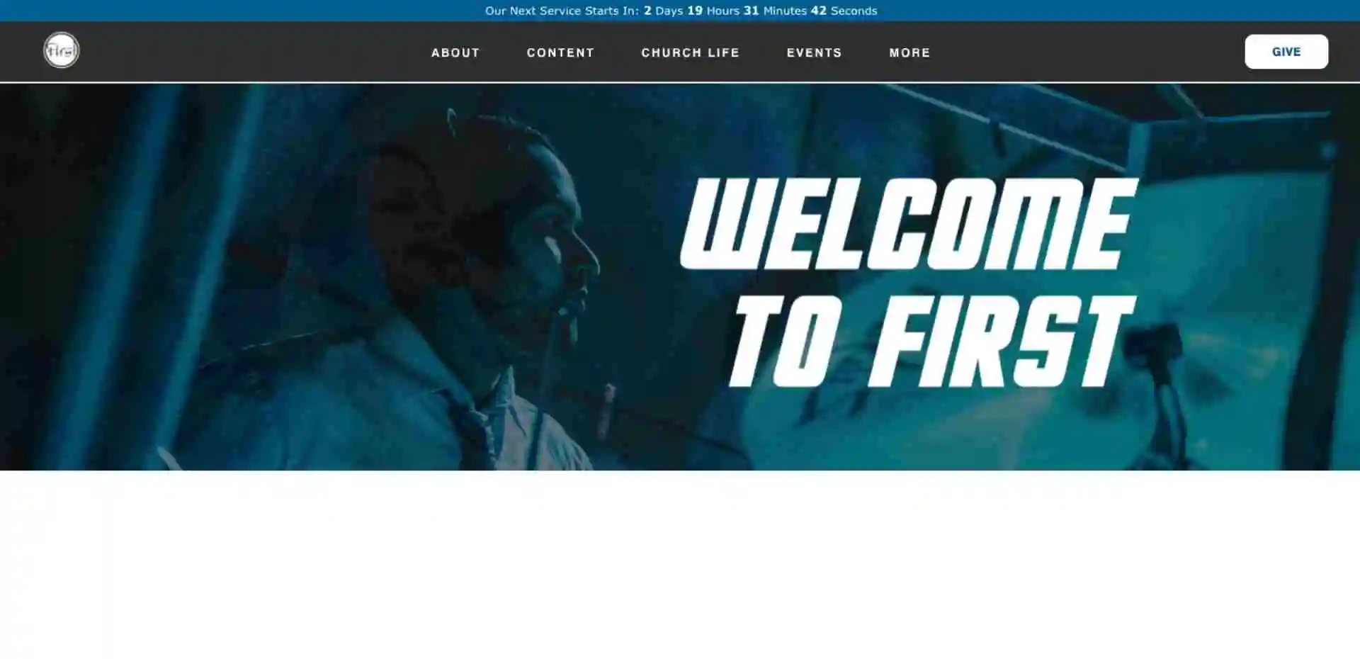
Well alright, hey we are in the Trust phase of the Discover, Like, Trust, and Engage church website framework that we here at Ministry Designs called the Alpha Church website framework and we're on First Baptist Church of Perkasie’s website. They've done a really good job at thinking through the progression of somebody who's going to be planning a visit, they talked through it in three videos and the videos are really well done. There are a couple of things that I would personally tweak about the verbiage in there but they refer to visitor parking and things like that which is good. This is something that I can't take credit for but my friend Ryan Wakefield over at Church Marketing University just does an incredible job at helping people think through the “us versus them” kind of mindset. Ultimately, what our goal is is to break down barriers and, when we use terms like “visitor” or “our staff” or “our team,” what we're doing is we're ultimately creating an “us versus them” or “us versus you” kind of structure and subconsciously, that creates barriers which is the direct opposite of what we're trying to do from a staffing perspective. The way that they've thought through their site, if this is your first Sunday here, obviously your kids are going to be important, and then let's schedule a visit. They've done it in videos, you can pre-register your kid, you can watch a service, here are some service times for you to think through, here are some frequently asked questions. These are all critical things to breaking down barriers and building trust to get somebody to take the next step which is engaging with you in an in-person service. So well done First Church, keep up the good work!
Journey Church

Alright, here we're taking a look at Journey Church and we are in the Trust phase of the Discover, Like, Trust, and Engage Alpha Church website framework. In this particular site, we see they've got these buttons right up front that say, “What do you want to do? You're here, we're excited that you're here.” If you click on “Visit Journey” it takes you right to a plan a visit page which is in my opinion one of the most effective ways that we can be proactive about answering questions. This kind of gives you as the church an opportunity to really create a catch-all place for new visitors. We want to think about what the people that are visiting our church are asking and then ask ourselves how do we answer those questions in a way that's uniform, unique, and specific to our church and what creates distinctiveness for us. Then what it does is create trust.
So, what to expect at Journey Church. On a Sunday morning service, you can expect this, you can find your personal next step which makes sense to you, next steps, discover your purpose, a place to belong, join a team. Your family will enjoy it; in this, we're addressing the fact that we have a children's ministry, and then we have a youth ministry. Those are important and then they have a section to answer what will happen when I visit for the first time, what do I wear which is a great thing. One of the things that I've talked about in a lot of the other videos is that the question “what do I wear” is one of the main questions people ask when they visit a church because they don't necessarily want to get caught off guard. So well done Journey Church. They have done a great job. I would take a look at this for some inspiration because they've really been proactive about answering the questions that people in their area are going to ask.
Mercy Hill Church
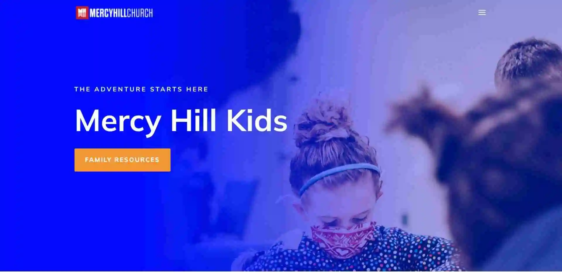
Alright, listen we are in the Trust phase of the Discover, Like, Trust, and Engage Alpha Church website framework and we're going to just go ahead and skip right to the kids’ page at Mercy Hill Church because they've done such an incredible job of being intentional about the information that they provide. I'm sure that as we scroll through the site, you can see that they have fun, that children matter, that it’s an engaging message for kids. But what do they talk about first? On your first visit there is a safe and secure check-in. What does that look like? Well, there's a security team, there are unique tag ids, there are text-accessible alerts during service. All of these are things that a parent would want to know. They've got a plan for kids. If you are a church that desires to reach young families, this is very high up on the list. I wouldn't say it’s mission-critical or most critical, but it is very high on the list of critical things that you have to think about. How do we fully equip our children's ministry volunteers to think through some of the safety potential safety issues that could come up, what are we going to do about them, and then how do we effectively articulate or communicate those on our website? If you're looking for inspiration on that, Mercy Hill Church has done just an incredible job doing that!
Cascade Hills Church
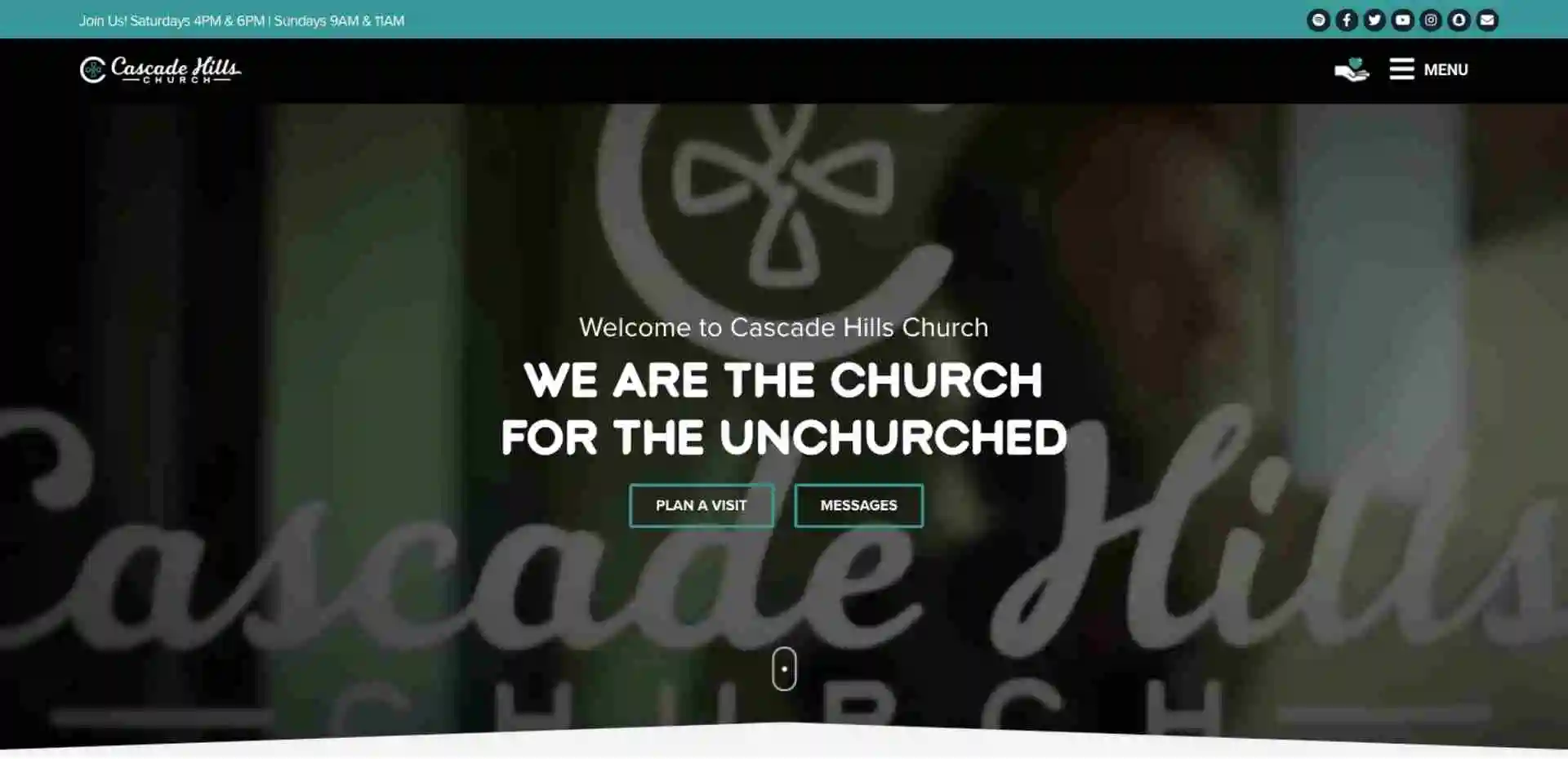
Alright, well hey, and welcome to episode one of the Trust phase in our church website Alpha framework. I am just incredibly excited about this website because of what they've accomplished on many pieces of the framework. What they’ve created here makes a lot of sense as you can see it's well designed, it's pretty, they've got some modern elements to it. It’s pretty easy to navigate and find what you're looking for and to understand what's important to this church but they've also made it a priority to ask you to take the next step. When you're planning a visit, they want you to understand they’re thinking of you. They say, “Hey, watch a tour video, let's break down some barriers.” Some of these elements you would know what you can expect from first-time guest registration to parking. How do you park, where do you park, VIP experiences, all of these things. What it does is it allows you as a viewer for the first time of this church's website, to be confident in the fact that this church has done this before. That they have a plan for you, they've thought this, they've gone through this process with many many people, and you don't have anything to worry about as a first-time guest.
One of the biggest hurdles is to get people to move offline and into an in-person experience. Not only churches but restaurants, mechanics, everybody, every situation, walk of life. The fact that the person engaging digitally has to trust you enough to encounter you physically. I know that sounds crazy but it's so much easier for people to just hide behind the screen and not have to worry about any other potential insecurities or some of the awkward social situations that they might encounter. The fact is that this church has been proactive about addressing some of these frequently asked questions. Where do I go when I get there? What do you do for my kids? This is just an incredible example of being able to be proactive in solving some of these questions. To me, this is a well-done site and you know they're there asking for you to fill out this form for the first time if you're never been there because they want to be able to help you. They’re going to be able to greet you. Thinking through a plan of visit scenario is very critical to building trust with people.
Christ Community Church
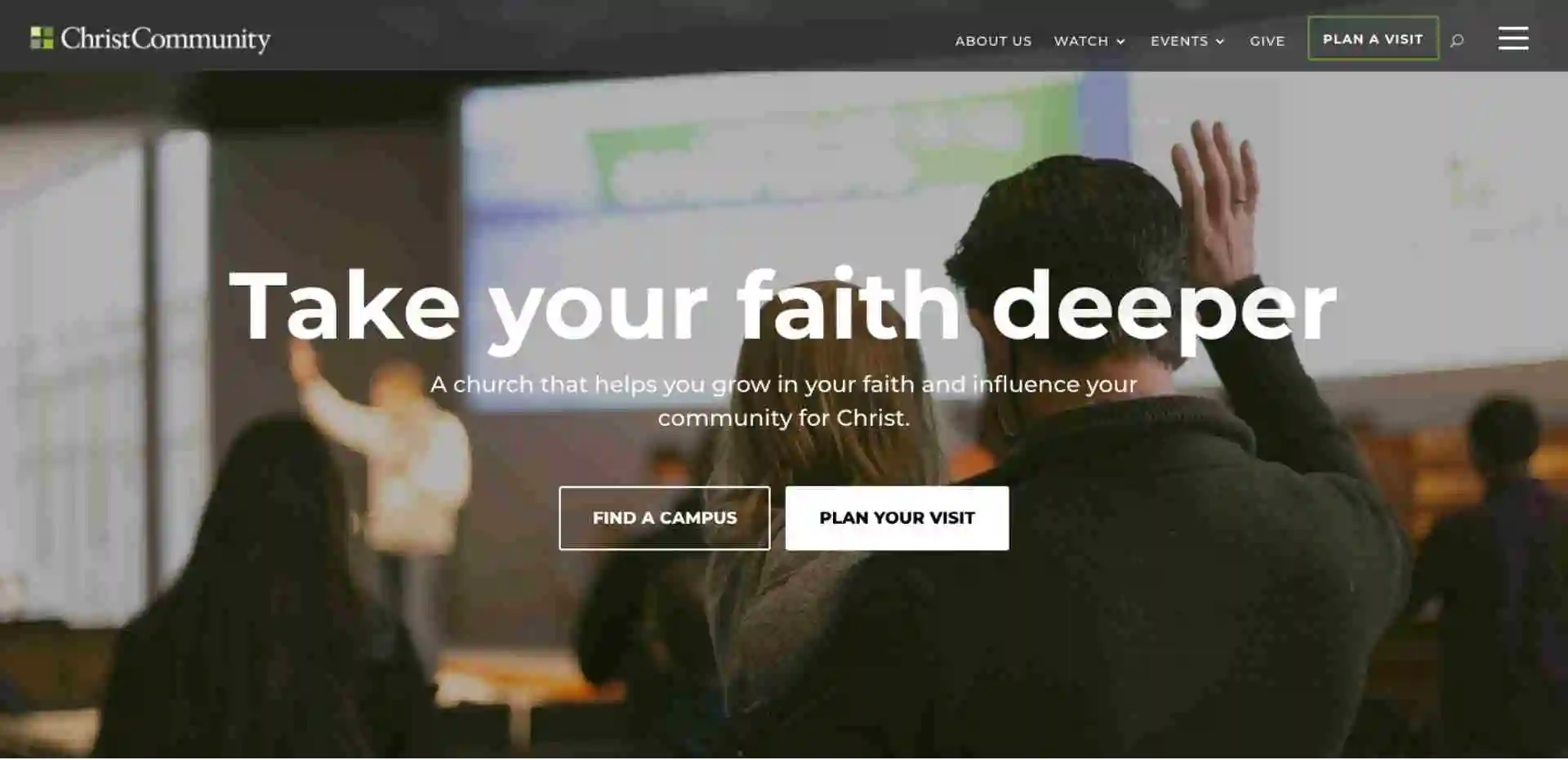
Alright, well hey, welcome back to our Discover, Like, Trust, and Engage Alpha church website framework. Today we are talking about the Engage phase of the process and basically what we've done is we've taken somebody all the way through discovering you, liking you, trusting you, and now it's time to get them to engage with you. Christ Community has done just an incredible job of picking one thing that they want you to do on their homepage. It's very clear.
If you think through, “Okay, where are all the options on the homepage?” There are a lot of buttons on most homepages. But there's one prominent thing that Christ Community wants you to do. They want you to plan a visit, find a campus location, and plan a visit time. You have a few options, you can choose a location to visit in person or you can watch online. As you scroll through here, visit us this weekend, all of the major calls to action, these big call-out sections, visit us this weekend, times, and locations, campus information. They want to get you to visit a campus. I mean it's everything that you would need to connect with their church and it's a pretty intuitive process. Quite frankly, it's very clear what they want you to do; so plan a visit, pick a campus, come on Sunday, engage with us, the entire way through their homepage. They've done an incredible job. We're really looking for a detailed call to action or very strategic or specific call to action, and that's exactly what Christ Community Church has done here.
Family Church
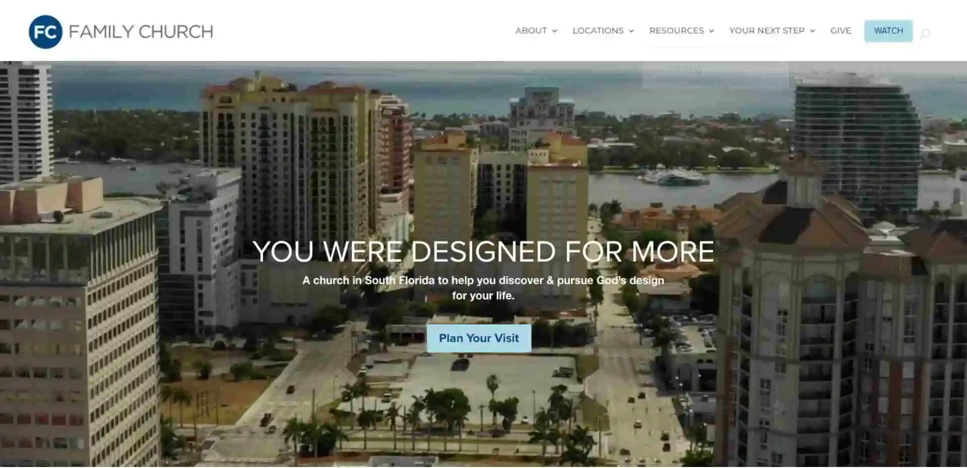
Alright, well, we are back with another episode in our Discover, Like, Trust, and Engage church website framework here at Ministry Designs we like to call that the Alpha framework to go along with our Omega website builder. In this particular video, we're going to be talking about the Engage phase of the process and I just want to talk about Family Church. The way that they have designed their homepage to specifically accomplish one thing, it's got multiple calls to action on the home page, and what it allows you to do is it just says, “Hey the main thing that we want you to do while you're here is to plan a visit.” I mean it's very basic. Plan a visit is very direct. Plan a visit, watch online, plan a visit, plan a visit… I mean it is everywhere! Plan your visit may feel a little redundant but the reality is we now know exactly what they want us to do which is plan a visit. Clicking on the buttons makes this form pop up and it's going to allow you to select a campus and do this whole process. What it does is it just reiterates, “Hey we want you to plan a visit.” There are options all over the home page but the main thing we want you to do is plan a visit. Family church has done an incredible job with calling that into action and enabling people to engage in the next steps.
What makes a quality church website
The benefits of an effective church website
-A church website acts as your online hub
-A church website helps church seekers find you
-A church website offers a “virtual tour” of your ministry
-A church website enhances your presence in your local community
-A church website offers easy-access services for members
-A church website creates a digital safe have
The impact of not having a well-made church website
-A lack of a good website makes you invisible
-A lack of a good website kills engagement
-A lack of a good website fails to meet people where they are
A comprehensive guide on church websites
-Lay the foundation with the basics
-About us, staff, and ministries pages
-Service time, event, and resource pages
What Is Are Church Wesites?
I’ve been in the website business for a long time now. And not just that. I’ve been working on church websites for years. My company helps churches of all sizes maintain fast, functioning websites that don’t become dated twelve months after their creation (as is sadly too often the case.)
Over my time spent in this industry, I’ve discovered that the concept of a “church website” is often misunderstood. So, let’s kick this off with a quick run through what a website is and the needs that it should meet.
A church website is often seen as little more than a pretty digital decoration for your ministry. Much like the impressive flat-panel screens on the walls or the handmade backdrop, you invested in for your next series, your site is just another little factor that sends the signal that you’re a church that has its act together.
The truth is, though, your site primarily offers its value as a tool that provides information and enables specific actions. It serves multiple audiences, including congregants and potential visitors. It also reflects your beliefs and can work as a powerful kingdom-building tool.
Your church website has a job to do.
What Makes a Quality Church Website
Often we hear “That’s a good Church Website” in fact, there are lists of them published all over the internet.
But really makes a church website good?
The problems begin to arise when a church website isn’t used for its functionality. If critical information is missing — or even simply difficult to find — it can undermine the entire purpose of your site.
If a church website is supposed to be functional, the natural next question is: what things need to be present to make your site effective.
I mentioned earlier that you need to give your website a job… A little shout to my friend Ryan Wakefield from Church Marketing University for that analogy.
And like every job, it needs to have a job description.
I like to break down the factors that make a church website “good” into four distinct categories.
We call this the...
Alpha Church Website Framework

The Alpha framework is a sequential process that builds from one step to the next. If the first step isn’t achieved, the next step simply can not happen and your website is failing at its job.
Discover is basically search engine optimization — commonly referred to as SEO — can be an intimidating term. But all it really means is that your site is created with a focus on ensuring that people can find it. If your site isn’t “discoverable” on its own, it’s going to be hard to get much value out of it.
We’ll cover SEO tactics and info toward the end of the resource in the section on promoting your website.
So keep reading…
Likeability is directly tied to the overall design of your website. If your church website is well designed, it will subconsciously provoke positive feelings about not only your website but also your church.
Here’s the thing… This part of the process happens in a split second for a first-time visitor.
It may sound a bit extreme, but the experiences that they have, both negative and positive, really can make or break their future relationship with your ministry.
Likeability isn’t just pretty pictures or using the right words. It involves the entire design and structure of your site. From navigation to the color scheme, orientation to picture choices, the design, and layout of your site is a critical factor that can heavily impact its success or failure.
If you have a great conversation with someone that you just met and it ends with them misleading you or aggressively asking for a personal favor, it doesn’t equate to a net positive.
On the contrary, you’re probably going to think twice before you engage with any other stranger for a long time to come.
A church website is no different. Your site is often your first opportunity to develop trust with those that can or already do attend your church. From proactively answering questions to setting up respectful giving and donation options, you want to ensure that your site is building rather than hindering the trust factor between your ministry and your community.
Listen, in today's world, people won’t go to a restaurant let alone a church without trusting the information that they find online about the organization.
Not only do we have to build bridges, but we also have to be intentional about tearing down barriers.
Finally, there’s the good ol’ call to action. CTAs are once again often associated with things like marketing and sales tactics. But you can also use them (in a less sleazy way, too) on your church site.
An effective site uses opportunities to spur individuals to action. This could be including a “Plan A Visit” button on the home page to encourage new people to visit — more on that in a bit. It could also include offering a safe and secure tithing option, explaining volunteer opportunities, or even asking someone to sign up for your newsletter or daily devotional but whatever that specific call to action is, it needs to be clear over and over and over again.
The Alpha Frame, Discover, Like, Trust, and Engage should all be top priorities for any church website. That’s why I’ve worked hard to create my company’s ministry-focused church website builder.
Our tool (Omega ~ See what we did there?) enables churches to create websites that answer all of these key areas. It also adapts and grows with the ongoing needs of a ministry. It offloads the grunt work while ensuring that you create a site that is more than just an item on an overloaded checklist.
The result is an efficient and effective website that doesn’t just dazzle. It meets the needs of those who use it.
The Benefits of Effective Church Websites
Alright, before we shift to focusing on the various elements that make up a good website, I want to spend a few more minutes going over the benefits that come from a good site.
This is important. Even if you’ve grasped the value that an effective site adds to your ministry, it’s worth taking the time to understand the specific, tangible benefits that it provides. These can serve as valuable reminders of why you’re putting the time and effort into your site over the long haul.
There are many, and I mean many, ways that a healthy website can benefit your church. That said, I’m going to highlight half a dozen of the biggest ways that a good site can pay dividends over time.
Church Websites Act as Your Online Hub
The organizational element of a good website is hard to overstate.
There is an endless procession of digital services available. From payment software to social media platforms and everything in between, it’s easy for a ministry to find itself utilizing a plethora of digital tools. In addition, emails, texting, forums, and other channels are used to communicate information.
Your church website provides a single location where you can centralize all of this online activity. It’s one easy-to-find place that people can use for a variety of needs associated with your ministry. On top of that, you can rest in the fact that you unequivocally own your website content — which is a bit of a hazy area for places like YouTube or Facebook.
Christ Alive Church In Battle Creek, Mi has done an increadable job of this:
Church Websites Help Church Seekers Find You
If I’ve said it once, I’ve said it a thousand times. Church marketing may not be fun, but it’s necessary. Now, that isn’t a license to use dirty marketing tactics to get people’s attention or lure them into your building.
Nevertheless, it’s perfectly reasonable to promote your church to your local community. Signs in the front yard, outreach efforts at local sports events, and word-of-mouth marketing are all normal and widely accepted ways to spread the word. Even things like coffee and donuts on a Sunday morning are subtle nods to effective marketing tactics.
Your optimized and well-designed website is another way you can ensure that your local community is aware of your ministry and the services that you offer.
Back our example church, Christ Alive. If you're looking for them in Battle Creek, you're going to find them at the top of the search engines.
Church Websites Offers a “Virtual Tour” of Your Ministry
Along with helping with local brand awareness, a good website can also serve as an initial point of contact with anyone thinking of visiting. If your site is created thoughtfully, it can offer what amounts to a “virtual tour” of your ministry.
Your home page, which we break down in detail in the content section, is the “door” that welcomes individuals into your church experience. From there, you can use about us pages, Plan Your Visit buttons, FAQ sections, videos, and pictures. These elements show anyone interested in dropping in what they can expect when they arrive.
Think “TRUST” from the Alpha Framework.
A Church Website Enhances Your Presence in Your Local Community
Most of the time, your website is seen as an outward-facing ministry tool that helps direct congregants and visitors alike inward toward your church. However, a good website also can have a positive external impact on your community, as well.
This is especially true if you have church ministries that aren’t just related to Sunday morning services. A website can enhance the impact that food pantries, sports leagues, and other faith-based activities can have on your local community. It builds your brand awareness and helps those around you see the impact that you’re having on their local neighborhoods.
We like to call this being the hands and feet of Jesus, and it’s ok to tell people about it.
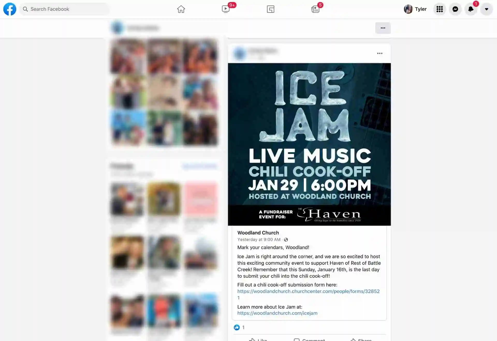
Plus it gives people share on social media when your doing something unique. You'll notice that person included direct links back to this church's website.
A Church Website Offers Easy-access Services for Members
Along with outreach and brand building, your website can also streamline a lot of activities that your congregants engage in on a regular basis. You can upload church bulletins and sermon notes, provide live streaming access, and offer a way for folks to give online.
This doesn’t just make things easier for your church’s members. By making basic churchgoing activities more accessible and location independent, you encourage your congregants to actually interact with you, no matter where they are.
This can increase the amount of engagement that you receive as people are reminded and enabled to take action even if it isn’t Sunday morning and they’re physically “in the building.”
A Church Website Creates a Digital Safe Haven
Finally, a good church website can be an online outlet for your staff, church members, and visitors to interact with one another in a safe environment. From support and spreading the word about ministry opportunities to comment sections and live streaming access, your website offers a digital safe haven that everyone can access without fear.
Social media sites and online forums are rife with trolling and inappropriate behavior. Depressing news outlets and all manner of temptations are easy to find.
Your church website can offer a comfortable, predictable, and encouraging experience, whether someone is tithing, commenting, looking for information, or anything else.
The Impact of Not Having a Well-Made Church Website
I want to very quickly run over a couple of the biggest negative risks you’re taking if you don’t invest in your website. These apply to both having a poorly done site as well as not having a website in the first place.
Don’t skip this section. Please. It’s easy to look at benefits like those listed above and think “sure, those are nice, but we just don’t have the time to invest in them at the moment.”
But this section is different. It highlights how not having a good site is hurting your ministry ...like, now. This very moment.
Of course, none of this should cause anyone to panic. I’m not trying to stir up fear or cause hasty decisions. All the same, understanding the negative impact of a bad or nonexistent website has become an essential piece of knowledge for those operating a ministry two decades into the 21st century.
A Lack of a Good Website Makes You Invisible
You can have a great sign out in the front yard with big font and good color. You might even have one of those message boards where you can post encouraging Bible verses or witty sayings each week for those driving by.
Once upon a time, this was all that was needed to get the attention of passers-by and encourage them to stop in for a visit.
Now, with grocery delivery, remote work, and video playdates, there are fewer and fewer reasons for people to leave their homes. Instead of spending hours on the road each day, most local community members tend to spend hours online.
If you don’t have an online presence that is optimized and able to show up in search results, you might as well be invisible, even to those living within a mile or two of your front doors.
A Lack of a Good Website Kills Engagement
One of the subtlest impacts of a good website is the fact that it pushes people to take action.
For instance, a person interested in your church must decide what to do when they visit your website and are confronted with an invitation to plan a visit. A person staying home sick from church knows that the website offers a way for them to still participate in a live stream service. Those who forget to give their offering at church can still hop online and give through your site.
By creating a subpar site — or even having no site at all — you miss out on all of these opportunities to stir up activity in your local communities. You lose the impact that comes from online engagement from your congregation along with the interactions from those thinking of paying a visit.
We should never feel that a ministry needs to operate as part of the world. On the contrary, we’re called apart by God to be a light in the darkness.
However, that doesn’t mean we’re supposed to eschew every possible worldly tool as if they’ll somehow sully our holiness.
Think about it. We use soundboards and speakers, televisions and projectors, computers, electricity, construction, traditional marketing, and countless other “worldly” things to make our ministries run.
Building a quality church website is just another way to use the tools of the world for the good of the Kingdom. In this case, it’s particularly relevant because it also enables you to answer a critical need: you can meet people where they are.
By building a website that functions well and offers important, accessible information, you send the message that you’re able to minister to people in a manner that they understand. You’re up to date with the times and are able to communicate and interact with your congregants in a way that they’re comfortable with.
There are over 200,000 people a month searching for the term "abortion"
Alright, at this point we’ve thoroughly covered what a church website is, the elements that make a website effective, the benefits of a good site, and the drawbacks of not having one. Now it’s time to dive into the specific pages and pieces of content that go into a great website.
A Comprehensive Guide on Church Websites
Hopefully, by now, you realize that a good church website is an asset for your organization. This mentality is a crucial first step. It takes an exhausting albatross around your neck and turns it into a powerful tool that can enhance every part of your ministry.
In the following section, I’m going to break down the nitty-gritty aspects that can make or break a website.
Now, as a disclaimer, creating a good website is an art as much as it’s a science. There isn’t a one-size-fits-all solution. On the contrary, with so much diversity in beliefs, church size, membership demographics, and so on, you need to find the elements that uniquely suit your site to your ministry’s needs.
But again, If you filter everything that I’m about to say through our Alpha Framework
Church Website Framework you’re going to be on the right track.
Okay, now that that’s out of the way, let’s get started. We’ll begin with some more nuanced elements that apply to your entire site. Then we’ll dive into several of the most important pages that make up the bulk of most effective church websites.
Sound good? Here we go.
Start With Your Audience
We’re going to start with an area that can often feel like the icky marketing side of the deal: defining your audience. It’s easy to feel uncomfortable breaking down your “target demographic” as you work on your site. After all, you’re a kingdom-building ministry that is looking to attract anyone and everyone with a heartbeat and a need for the Lord.
But I’m not talking about targeting specific groups of people to the exclusion of others. What I’m talking about here is the need to identify the groups of people that are already attending your church or living in your community.
Think of it this way. If you worked in a nursing home, would you start blaring cutting-edge pop music over the loudspeakers? Of course not. You’d probably dig up some oldies but goodies that would resonate with the residents.
In this case, you’re not excluding others. You’re simply tailoring your activities to the crowd that you’re working with. The same could be said for a concert, classroom, office, or any other gathering of individuals.
This also goes for your church, as well. As you consider your audience, focus on three primary areas:
Start With Your Audience
Where is your church located? A recent study I read said that people are turning to Google to find a solution to their problem within 5-10 miles of their house.
The same is true for your church. Draw a 10-mile radius around your church and do a demographic study. It’s likely that your congregation demographic is going to be representative of your geographic area and you need to speak to them.
Potential visitors
The next group to consider are those who might visit your church.
Now, this can obviously apply to a huge number of people. Those passing through the area or in town for a visit could come on any random Sunday morning. With live streaming becoming more popular, your reach could extend across the nation and even the world, as well.
But in this case, you can reign things in and focus on the people living in your local community.
Again, ask poignant demographic questions that can help you better understand the kind of people living in your neighborhood.
What are their interests, cares, and concerns? How can you express the value of your ministry to them properly?
Other Ministry Connections
The third and smallest group to consider are various connections to your ministry. For instance, if you collaborate with another church, your sight might get traffic from their leadership team.
Another example could be missionaries that you support who want to visit your website and see how things are going with your church. Your additional ministries can also generate third-party traffic. These visitors may not necessarily be interested in attending your church but they’ll still want to find certain pieces of information such as your beliefs or charitable activities.
Considering the different kinds of individuals that will most often patronize your website is a critical step in the website creation process. It ensures that you have the interests and proclivities of each of these groups in mind as you go along. This can help you accommodate all of their needs.
Navigation and Orientation
The next pair of items that I want to cover are two critical areas of logistical concern. Each of these can impact the usability of your site. Using them correctly can be the difference-maker that takes a site from unusable to highly effective.
Navigation
Website navigation is a huge topic in the website design world. You can create a drop-dead gorgeous website, but if it isn’t easy to use, it can be completely useless. - Think “Engage” from the framework.
The way you set up the navigation for your site is a huge part of what makes it work for users. There are multiple factors to consider here.
For instance, as you create pages, make sure to provide links to additional resources. For instance, if you mention that you do something “because of your beliefs,” use that opportunity to link to a statement of faith on your blog or resource page.
With all of that said, In my experience, the main pages that your website needs to have linked your navigation, from left to right are as follows.
-Home
-New Here
-Connect
-Messages
-Contact
-Give
Here’s an example:
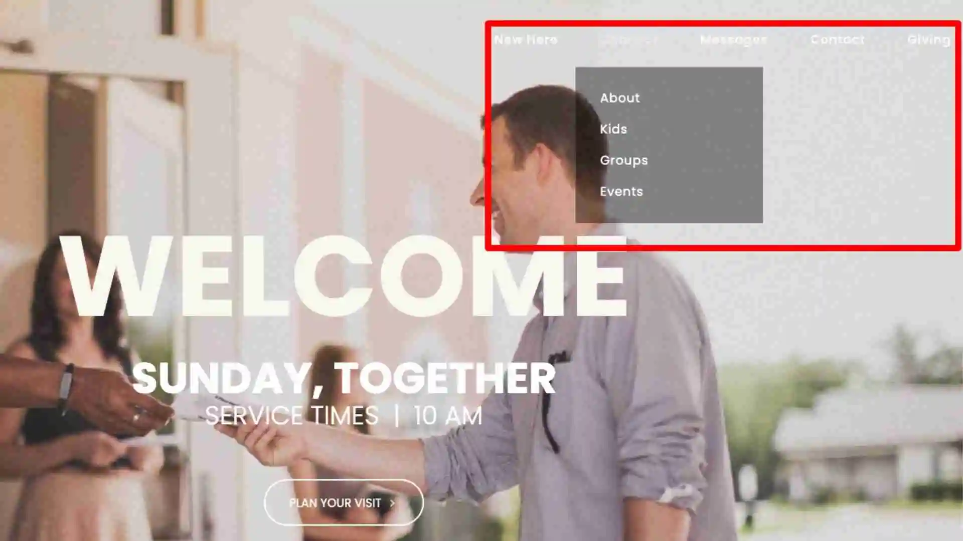
Put links and CTAs that point to important pages on your site in easy-to-find places, too. For instance, a pop-up or a hero banner — that is, a call to action that comes out of the side of the screen — can make it extra easy for visitors to find the “Plan A Visit” page.
However, you choose to do it, make sure to prioritize the navigation element of your website to ensure that its users can find whatever they need without trouble.
Orientation
Along with the navigation element, you want to consider how your site is laid out. The orientation of your website’s contents can, once again, define if someone has a pleasant or miserable time.
Think of times that you’ve visited a website and found that you feel overwhelmed or confused by how everything is laid out. If you want your church website to shine, you need to consider this subtle yet important aspect of website design.
Two areas to focus on include lists and content placement.
For lists, always remember that people read from left to right and top to bottom. So, if you’re laying out something like a menu, make sure that the most important items are on the top and to the left.
In addition, I tend to recommend prioritizing visitor content in your orientation strategy. You don’t want to ignore the digital needs of your congregation, but the truth is, your church members won’t mind the need to dig a little further into your site to find a donation button or your latest newsletter update.
Visitors, though, well that’s another story. If a visitor comes to your site and they don’t understand what they’re seeing, they’ll take off within seconds. Even worse, if they’re immediately confronted with something like a request to donate or tithe, it could put a bad taste in their mouth right from the get-go.
Instead, put things like service info and “Plan Your Visit” buttons to the left and at the top of your menus.
When it comes to the layout of your website pages, once again it’s wise to be thoughtful about how this will help or hinder the user.
Try to use things like scannable formatting (i.e. plenty of headers and small paragraphs) to make the content skimmable. In addition, be informative while also being as concise as possible. The average website visitor will likely read as little as 20% of your site’s content as they skim along. Don’t overwhelm them with too much to read, or they’ll completely miss the important stuff.
In other words, don’t add fluff to your text. At the same time, don’t get wordy or complicated unless you’re on specific pages, such as a blog post where you’re going in-depth on a theological question.
Lay the Foundation With The Basics
Finally, before we get to the individual pages, let’s go over a handful of the foundational website basics. You’re going to want to have each of these lined up before you dive into creating your site.
If you already have a site, that’s okay. You’ll still want to take this part seriously.
If you want to improve things, it’s worth going over the website basics every once in a while. Reviewing a list like the one I’ve provided in this section can help you ensure that you’re implementing everything correctly and your site is doing what it’s supposed to.
Now, like it or not, when you consider your website, you should focus on your church branding tools. As I’ve said many times before, the idea of your “church brand” is easy to shrug off as a worldly marketing technique.
But before you move on to other areas of the guide, remember, we’re not talking about tricking people into thinking your church is something that it’s not. Your church’s brand should be designed to reflect the genuine personality of your congregation.
Are your current ministry branding tools effectively demonstrating what your brand is? Does your website, in particular, operate as a clear and obvious extension of your ministry?
That’s where the basics come into play. If the rudimentary branding tools are in place and doing their thing, you can rest in the fact that, at its core, your website is set up for success.
Tools that you can use to infuse your site with your church’s brand include:
- Domain name/URL: The name of your website address is important. Make sure you choose something that is easy to remember and clearly connected to your church. That way, whether someone is typing it in by memory or searching it on Google, they’ll know when they’ve found the right site.
- Logo: Your ministry logo is a great way to tie all of your online content together. It provides consistency, whether you’re giving driving directions, posting a sermon, or anything in between.
- Color scheme: Along with your logo, you also want to choose a basic set of colors that you can use throughout your website and online content. This can be any combination — I’ve literally seen every color used in church marketing. The important thing is that you stay consistent over time.
- Tone and voice: The tone and voice of your church brand are important. This doesn’t mean you need a giant book of grammatical guidelines. However, make sure your online content sounds similar to the way you lead the church — and has the same feel that your congregants have when they interact, too.
- Photos: It may be tempting to use stock photos on your church website. I strongly advise against this. That can be very misleading. Remember that honesty is the best policy here. The photos on your site should be relevant to your visitors and representative of your church. They should show everything from greeters and parking lot attendants to members and leadership in action.
- Images: Apart from photos, if you use other visuals on your site, make sure to prioritize consistency and quality. If you use tacky or hack-job images, it can impact the professional feel of the content. Try to find a good graphic designer for your images as well as a professional photographer for your photos.
As a quick aside, you don’t have to apply this extra-careful photo and image sourcing philosophy to all of your visual needs. You can use stock photos for things like social media posts and backgrounds for worship lyric slides.
Just make sure you’re still getting them from an affordable, high-quality source, like our very own Ministry Designs library of free church graphics.
Church Website Content 101
Alright. I know it took us a long time to get here, but I promise you it was worth the roundabout journey. At this point, we’ve set the stage, reviewed the basic building blocks of a church website, and considered the audience that we’re writing for.
It’s now officially time to go over the individual content pages of your website. If you already have a site, I suggest you do three things. Start by keeping this page open while you read. That one’s pretty obvious.
In addition, find another screen, and open up your church website, as well — if you have one. If you can, try opening it on both a computer and a mobile device. That way you can follow along and compare my recommendations to your existing pages in multiple formats.
If you don’t have a site already, you can still do a modified version of this exercise. Find a few good church websites from your denomination or the style of church site that you want to emulate. (I offer a few good sites at the end of this resource, as well.) Then you can see how well they do or do not apply the information that we cover here.
I also suggest opening a document or getting out a pen and paper — whatever suits your fancy — to take notes as you go along. There are a lot of web pages to review, and you don’t want to lose track of potential improvements as we move from one page to the next.
Once you’re set up, come back to this point and we’ll dive in with the most critical page of all: the home page.
Everyone knows about the home page. After all, it’s the most consistently viewed page on your entire website. A huge amount of your traffic goes through your homepage on its way to other areas of your site.
As a prime bit of digital real estate, your home page naturally plays a critical role in the success or failure of your church website. It’s where you make your first impression and others form their initial opinions about your church.
And make no mistake, this is a really big deal. It takes as little as 27 seconds for someone to formulate a first opinion. The first few things that they see about an individual or a place can set the tone for the rest of their relationship with that entity. Think about “Like” from our framework earlier.
That’s why your home page is so important. You want to put your best foot forward. You want visitors to immediately resonate with what they see. You want them to feel warm, welcome, safe, and in control.
If a website visitor is confused or unable to connect from the get-go, it’s going to undermine your site’s ability as an outreach tool.
Home Page Content
Okay, so what are you supposed to include on your home page, then? That’s the million-dollar question. And I’ll tell you right now, there isn’t a single, clear answer out there.
Everyone has their own opinion on what you should put on your home page. What’s more, the specifics tend to change depending on the kind of site that you’re running. For instance, an e-commerce site will probably prioritize things like sales funnels and shopping menus. Naturally, a ministry won’t have the same content front and center.
In the case of a church, there are a few things that you’re going to want to consider including on your home page, such as:
- A “Plan Your Visit” button;
- The geographic location of your church;
- Service times and other critical related info;
- Live stream viewing directions;
- AND AT LEAST 7 PHOTOS OF SMILING FACES!
We’ll go over each of these items in greater detail in a bit. However, they all deserve consideration for home page treatment.
Other Home Page Factors
Along with specific information, there are a few other factors that you want to keep in mind throughout your site, but especially on the home page.
For instance, it’s important that you create engaging, dynamic content. Your site should compel people to take action as soon as they arrive. This could be asking them to click a button to plan a visit or open a link to watch your latest service.
Whatever the case, you want to engage with website visitors or chances are they’ll take a quick glance and bounce.
This is also the prime place where you want to keep your church’s image in mind. Big, flashy graphics and stock images of massive groups of people worshipping aren’t the best options for a small church. You want something that will truly reflect who you are as a congregation. That’s why it’s important NOT to use stock photos for this part of your church website. If your home page has stock photos. THE VERY FIRST THING YOU NEED TO DO IS GET SOME REAL PHOTOS.
Select images that are honest and warm. I personally love to see church websites that open up with a professional photo of a service or meeting right in the sanctuary of the church itself.
This gives a website visitor an immediate feel of what it will be like if they visit your church. They’ll be able to see your congregation’s demographics, dress code, and demeanor. They’ll get an idea of the layout of the building and how inviting it might be.
Even your existing congregants can benefit from an image of your congregation in worship. It can remind anyone who hasn’t visited in a while what they’re missing out on every Sunday morning.
Another area to consider on the home page is how you communicate your brand’s essential information. I’m talking about things like your beliefs and opinions.
Now, I’m not saying you should use your homepage to go through a giant breakdown, 95 Thesis style, about everything that your church believes in. That’s the kind of document that you should post on a church blog or in a resource section.
However, brief and concise bits of information can be very helpful. What denomination are you? Do you have a specific Bible verse or philosophy that sums up your ministry?
One good way to address this area is by asking yourself a question:
What areas of your ministry are you assuming others will know about when they come to your website?
Whatever you find you’re assuming, take steps to include that information — right on the home page if you can. If it’s something lengthy, put a teaser on the home page and then link to the rest of the info somewhere else on your site.
Home Page Layout & Navigation
When it comes to the layout of your home page, don’t just plop things down wherever you want. Take the time to seriously consider where each thing goes. This should include:
- Choosing a small amount of hyper-relevant information that should appear immediately, above the fold as soon as your site loads.
- Laying out primary calls to action in places where they can easily be found.
- Setting up an easy-to-use menu with understandable terminology.
Regarding that last item, it’s also important to orient your site’s menus using a visitor-first philosophy. As I already touched on earlier, simply make sure to list your menus in order from visitor-focused items on the left to congregant-focused items on the right.
This may seem counterintuitive. After all, you want to take care of your congregation — and trust me, in most cases I agree. But once again, there are important reasons to invert the order in this situation.
You want to ensure that someone who isn’t familiar with your ministry is able to find what they need as soon as they arrive on your website. If you expect them to dig through a jumble of pages to locate certain information, you’re going to lose them. In contrast, you can expect a little more leg work from your church members when they visit your website.
It’s also important to consider what you’re putting where when you prioritize visitor content. For instance, most church congregants are going to visit your site because they’re looking for something like a church directory, contact information, or to give financially through an online portal.
Things like personal information and requests to donate should never be front and center on your site. They make people uncomfortable. It’s as simple as that.
Brevity On The Home Page
The last thing I’ll say about the home page is that you want to keep things as brief as possible. I know, that sounds hypocritical after listing so many things worth including on the page. But it’s true, nevertheless.
The key here is focusing on the right topics without using your home page for exposition. In other words, touch on essential things like planning a visit or giving but only use the opportunity to briefly point toward a more thorough breakdown on the subject on another page.
So, to summarize, when you’re vetting your home page, start by identifying the important areas that you want to address for visitors and congregants alike. From there, consider where you should put each piece of information to ensure that it will help the right people. Finally, review your home page and make sure that you’re being direct, concise, and clear with each piece of information.
Cross Bridge Church - New Here Page
The new here page is one of the most important pieces of information that you’re going to include. It really needs to be a logical and sequential process of a visitor coming into an understanding of your church.
I’m going to point us back to the “trust” portion of our Alpha framework.
On this page, you want to be proactive about answering questions a new visitor might have.
Here are a couple of questions to get thought processing going.
- Where do I park?
- What do I do when I get inside?
- What happens with my kids?
- Are my kids safe? … Side note (this is critical… Most parents care more about your volunteers being CPR certified than they do about you having a play place)
"Contact" Page
The next section we’re going to break down is commonly referred to as the “about us” section of a site. However, in the context of a church website, this often includes an additional focus on things like staff members and other ministry details.
It’s tempting to use this section as an information dump. Lengthy blocks of text are common to find. However, I’d challenge you to once again think concisely as you formulate your about us page.
Remember, the goal here isn’t to overwhelm website visitors with mindless minutiae about your church and its leadership. You want every piece of information to be interesting and relevant.
Another good question to ask yourself as you write your about page is:
How will this information help someone who attends or is thinking of attending the church?
If there’s a clear reason to include a piece of information, by all means, stick it in there. Just make sure to go over each section with a fine-tooth comb to make sure everything has a purpose.
Now, let’s break down the three main sections that tend to populate connect pages on most church websites.
Church background
The most common element that you’ll see on an about us page is a description of the church itself. This can include several important factors, such as:
- When, where, and why your ministry got started;
- What denomination you belong to;
- A statement of faith;
- Vision and mission statements.
This is an area where you can get deeper into doctrinal and spiritual elements. However, I still strongly recommend that you avoid getting too wordy. If you find that you can’t summarize your beliefs in a couple of paragraphs, opt to break it down further in a different setting like a blog post or podcast episode.
Bios and Profiles
The next section we’re going to break down is commonly referred to as the “about us” section of a site. However, in the context of a church website, this often includes an additional focus on things like staff members and other ministry details.
It’s tempting to use this section as an information dump. Lengthy blocks of text are common to find. However, I’d challenge you to once again think concisely as you formulate your about us page.
Remember, the goal here isn’t to overwhelm website visitors with mindless minutiae about your church and its leadership. You want every piece of information to be interesting and relevant.
Another good question to ask yourself as you write your about page is:
How will this information help someone who attends or is thinking of attending the church?
If there’s a clear reason to include a piece of information, by all means, stick it in there. Just make sure to go over each section with a fine-tooth comb to make sure everything has a purpose.
Now, let’s break down the three main sections that tend to populate connect pages on most church websites.
Church background
The most common element that you’ll see on an about us page is a description of the church itself. This can include several important factors, such as:
- When, where, and why your ministry got started;
- What denomination you belong to;
- A statement of faith;
- Vision and mission statements.
This is an area where you can get deeper into doctrinal and spiritual elements. However, I still strongly recommend that you avoid getting too wordy. If you find that you can’t summarize your beliefs in a couple of paragraphs, opt to break it down further in a different setting like a blog post or podcast episode.
Ministries
Your about us page is a great place to include some information about your church’s various ministries. There are a few different ministries that you can focus on here:
- Church ministries: The most obvious option is to talk about the ministries that are directly connected to your church. From Sunday school, children, youth to mid-week Bible studies to local charity work, let people on your website know what your church is doing with its resources.
- Affiliated ministries: This is also a great place to talk up some of the ministries that you’re affiliated with. A great example of this is a local charity that you aren’t directly responsible for but work with on a regular basis.
- Support ministries: You can also list ministries that you support as a church body. For instance, many churches support missionaries and other non-profit organizations. Including them on your about us page is a great way to shine a spotlight on these entities.
When it comes to ministries, actions speak louder than words. Nevertheless, it’s worth including a few words about the activities and charities that your church supports on your about us page. This is an ideal place to emphasize your ministries and how they are physically manifesting your church’s heart and kingdom work.
At the risk of sounding like a broken record, remember to keep these ministry sections brief. For entities that you work with, explain what they are and then link out to their websites. If they’re ministries that are native to your church body, consider setting up their own pages on your website, and add them as a subsection of this section in your menu.
You can use this additional space to discuss why they exist, what they’ve accomplished, how they integrate into your mission and vision as an organization, and how to volunteer for them.
Plan A Visit is a great example of something that needs its very own page but could and should be a subsection of “connect”
"Plan Your Visit" page
This next section is one of the most important areas of your entire site. Why? Because, as you are probably sick of me saying by now, your website is one of your chief marketing tools.
There are many sections of your site that can serve your church members. From giving to live streams to sermon notes, bulletins, and other info, there are plenty of ways that your congregants can benefit from a website.
Even so, often those who are going to get the most out of a website like this are going to be the visitors. We’ve already touched on a few areas where this applies.
For instance, if someone who has never been to your church visits your site, they should be able to get a feel for what it’s like to attend a service or other church-related event. They can find information about your staff, pictures of your building, details about your theology, and even directions to get there.
However, the most important area of your site, as far as visitors are concerned, should be your “plan your visit” page. If you don’t have a plan a visit page or you’ve never heard the term before, I’ll briefly break it down.
A plan your visit page is basically a page where you gather all of the information that can be helpful for a new visitor to know. Plan your visit pages often go by other names, like “I’m New,” “New Here?” or simply “Visiting.”
Usually, a button or clickable link is placed on the home page, the menu, or both locations, inviting newcomers to, well, plan their first visit. Occasionally the plan a visit content itself is put right on the home page, but I recommend putting a link there and then keeping the rest of the information organized in its own section.
Once they’re on the plan your visit page, a potential visitor should be walked through a series of steps that prepare them for a visit.
Now, I’ve seen all sorts of information included on a plan a visit page. Everyone includes some things and not others. They also tend to prioritize the information differently, as well.
I’ll leave it up to you to decide what you think visitors will want to know before they stop in. However, I’ll give you two challenges as you sort that out:
First, remember that this content is typically for someone that you’re still in the process of convincing to visit your church, so stay inviting, informative, and brief.
Second, consider asking recent visitors to your church what information they would have looked for when planning their first visit, then use this to inform how you structure the page.
With all that said, let’s go through a brief rundown of some of the items that you can typically find on a plan your visit page:
- Length of service: How long should a visitor expect a service to last? Is there a strict schedule or a more relaxed end time?
- Typical attire: How do people tend to dress when attending your church? Is there a dress code?
- Kids programs: What will happen to a visitor’s children when they arrive? Will you have a safe environment ready for them?
- Style of worship: What is the kind of music that your church tends to play? Do you do things like raising hands?
- Basic beliefs: Are there any fundamental beliefs that you think are important for someone to know before visiting?
- An FAQ section: Are there common questions worth answering? What about other things like testimonials or holiday service times?
You can list all of this info right on a page using text, pictures, videos, or a mixture of all three. You can even pull together an e-guide that someone can download and keep on their device as they get ready.
Your plan your visit page should be the most pulled together part of your website after your home page. It’s the area where you want to make a great impression that accurately reflects your church.
As you decide what to include and where to situate each item, just remember the goal: to give your church some personality. If your about us page is confusing rather than enlightening its readers, it needs an overhaul.
As a last note, remember that this info is equally used by both church members and potential visitors. Make sure to create the content with both groups in mind.
"Messages" page
One of the most fascinating portions of any church website is the part that breaks down a Sunday service. We’re talking about some very unique content that is exclusive to church websites and church websites alone.
Most of this content can be found in three areas: pages that cover worship, sermons, and live streaming. You can split this info up into individual pages or have them all in one area. You can also include them on a “Plan my visit” page or organize them in their own section of your site — or both.
Worship Info
Let’s dig a little deeper by breaking down your worship info. Worship is a major part of any service. Not only that, but the style of music and song choices can really make or break an individual’s experience.
Use your website to explain various aspects of your typical worship service. Talk about things like the style of music that you tend to gravitate toward. Address the overall volume, too.
Do you have variations of music for different services? You may even want to include a quick statement of your ministry’s official beliefs as they pertain to praise and worship.
Sermon Info
The other half of the worship coin is the sermon. Teaching and preaching are the heart and soul of any service, and they deserve some attention on your site, as well.
Apart from live streams, which we’ll cover in a second, there are several other aspects of your sermons that you can include on your website.
This starts with sermon notes and outlines. These can be very helpful, especially if you upload them ahead of time so that they can be used in real-time during a service.
On top of that, you can add things like an audio copy of each sermon as well as transcripts. There are plenty of software options out there that can quickly extract a text version of a sermon for anyone who prefers to read.
While the church is and always will be a geographically driven activity, we live in a day and age where accommodating the needs of those who aren’t physically present has become necessary. Pandemic or not, there are a growing number of reasons that individuals can’t physically be in attendance on any given Sunday morning.
It’s important that you make an effort to accommodate these individuals on your website. You can also use your site to add additional sermon-related notes. This is particularly useful if you’re doing a series and you want to keep all of your sermons, transcripts, audio, and third-party resource recommendations in one place.
Live Steaming
The place where both the sermons and worship elements of your church website come together is with your live stream. There are plenty of reasons to have a live stream these days. But just because you set up a feed to your service doesn’t mean it’s going to do the job.
Live streams can be finicky. Hosting platforms like Youtube and Facebook can flake out on any given Sunday.
That’s why your website is an ideal place to host a link to your live stream. This gives you a few crucial advantages:
- First, you aren’t beholden to anyone else for your content. Social media sites will often flag videos for random reasons, even if you technically have the right to use music and other content. By hosting it on your own website, you retain full control over your live stream content.
- Second, you have a safe repository to keep all of your live stream videos. It’s easy for live stream content to become buried on a social media platform. When it’s on your website, you can keep it in order, listed neatly by date or some other criteria.
- Third, you have some good fallback options. For instance, if you can’t get a stream to go live on a particular Sunday, you can record it in-house and then upload the video to your site after the fact.
If you’re nodding your head in agreement, but you aren’t sure what there is beyond Facebook and YouTube, never fear. There are plenty of professional live streaming options available. These offer crisp, clear videos that can be embedded right onto your website wherever you feel is most appropriate for your visitors.
My last word on Sunday morning website content has to do with organization. If you don’t keep your resources well-organized, they are going to quickly become more hassle than they’re worth.
Make sure to set up clear protocols for each area of your site. No matter who’s uploading a particular bit of sermon audio or setting up a live stream, have them include basic-yet-critical things like the date, the name of the speaker, and possibly even a brief description of their sermon.
You may also want to group your content into subcategories. This could be something as simple as organizing things by month or year. It could also be based on sermon topics or each series. Whatever you choose, make sure to create a system that will help your site users find what they need.
"Contact" page
The home page is a portal that gives visitors access to your entire website. The about us page helps people learn about your ministry. However, it’s the out-of-the-way “contact” page that functions as one of the most important action-oriented pages on your entire site.
This is the page that helps people take action when they want to, you know, visit your church. This can come in several forms, which is why there are multiple pieces of information that are critical to have on your contact page.
Directions & Locations
The world may be driven by technology and many aspects of life have gone online. But attending church remains an enjoyably in-person affair — as it should.
That’s why including directions and the location of your building on your contact page is always important. In fact, it’s so important, you should try to include your address on every page of your site if you can.
Put it in footers and headers as a clickable link. Include it on your home page. Add it to your menu options. This isn’t just for easy reference. It can also impact your local search engine rankings… but I digress.
When you create your contact form, make sure that your church’s address is front and center. This should come with any important arrival instructions, such as where to park or if there will be people directing the traffic.
If you want to go a step further, sign up for your Google My Business listing and then embed a Google map right onto your contact page.
Another great flourish is adding a picture of the front of your building. This is directly applicable to paying a visit and — like including the inside of your sanctuary somewhere on your home page — it can give people an idea of what to look forward to if they pay a visit.
Contact Information
Next up, we have the tried and true content of a “contact” page: your church’s contact info. As is the case with directions, there are many different things to keep in mind when forming your contact info section.
For instance, you want to consider including:
- Your complete address for physical mail;
- Any phone numbers associated with your ministry;
- Email addresses for your church;
- Social media links;
- Contact info for your individual staff members.
The goal here should be to provide multiple channels of information. This opens up more than one door to help you reach people where they’re most comfortable. Someone may avoid calling but is willing to send an email. An individual may want to check out your congregation on Facebook before paying a visit. You get the idea.
Make sure you’re accommodating the communicative needs of others as often as is reasonably possible — especially on your contact page.
Another way to go about assembling the content for this page is to create a contact form. This can offer an easy, simple way to reach out to your office. It can also double as a connection card option, offering fields for people to fill out if they have prayer requests, testimonies, or questions about your ministry.
Other Contact Page Considerations
Before we move on, there are a couple of other contact page considerations I want to throw out there.
First, you may want to use your contact page to create an online directory. This can be a great way to help your congregation stay in touch.
If you do this, though, be aware that you’re putting other peoples’ information up on your public website. It’s important that you get their permission first. You can also make your directory private (i.e. provide some sort of password or another way to access it.) Even then, though, I still recommend getting permission before including people.
Second, I want to add that the lines of communication that your contact information creates make a difference.
For instance, if someone fills out a generic contact form, it should go to your main office. However, if they want to share a prayer request, you may want to make sure it goes to the pastor or someone who will be able to properly handle sensitive communications.
"Giving" page
Directly opposite the “plan your visit” page is the “giving” page. While the former is directed toward new visitors, your giving page should be targeted toward those who already attend your church.
Not surprisingly, your giving page should not be front and center on your site. This will send all of the wrong signals when somebody drops in for a visit.
If the first thing that they see is a request for money, it’s going to put a bad taste in their mouth. On the flip side, if someone comes to your site looking to give, they’re not going to mind going through a couple of extra steps to ensure that you get their gift.
I recommend putting a “giving” option on the far right of your menu. As I mentioned earlier, people read from left to right. Make sure to put something like a plan your visit button first thing on the left. Then drop your giving option on the opposite end of the menu.
That button should lead to a page dedicated specifically to giving, tithing, fundraising, and other donation details. It’s worth having an entire page for this because of how many ways you can give at this point. Text-to-give, PayPal, and check-mailing info are just a few of the options out there.
Set up each giving channel and then use your website giving page to collect them all into one space. Include crystal clear directions, too. You don’t want to pour cold water all over someone’s desire to give by making the path too difficult.
At the same time, try to stick to the point. Use clear CTAs, and be concise. Include important things like ways to designate donations, but don’t use this space to start breaking down why it’s important to give. Save that for Sunday morning ...and your resources page, which we’ll cover in a second.
The one other thing that you might want to add here is any public financial data you might want to share. Further down on your giving page can be a great place for things like budgets and annual giving information.
The last thing I’ll mention here is that this is as good a place as any to stress the importance of security on your church website. Start with solid third-party tools that you can count on to process funds. Then use a quality church website builder to collect donations. That way, your online financial activity will stay updated and safe from cybercriminals at all times.
"Events" page
Event pages follow the same principle as your service time content, but with a distinct difference. In most cases, service time content will be filled with recurring, ministry-related activities.
In contrast, event pages tend to focus on one-off, isolated events. I’m talking about things like:
- Baptisms;
- Church barbeques;
- Fundraisers;
- Guest speakers and related activities;
- Cross-over events with other ministries.
There are many events that churches participate in over the year. Some of these are fun while others are serious. Some are important while others are low-key.
As is the case with things like staff profiles, you can handle events in different ways. You can list them all on a single page or you can create an individual page for each event your church participates in. If you do the latter, I recommend linking to each of these on a primary “church event” page.
Having a single location for your events can do wonders with event marketing. It gives you a predictable link where your congregation can go to get further information. In addition, if you promote an event on social media, Google Ads, or other marketing channels, you can point everything back to the same page. Then, if something changes or you need to update info, you can do so in one centralized location.
An event page can also be a great place to house things like promotional images, maps, and calendars. Again, this keeps everything in one easy-to-access location.
As a final note on event pages, this can also be an ideal place to include information for volunteering. This can be a general “contact” to volunteer” option. You can also detail specific volunteer opportunities and instructions for each event, depending on how detailed you want to be.
Promoting Your Church Website
Once you’ve built a complete website, you’ve done the bulk of the setup work. But you aren’t quite done yet. You still have to think about how you’ll promote it.
Now, technically, you can leave a well-built church site sitting there and it will still serve at least part of its function. After all, if your congregation knows that it exists, they can visit it at any time to gather information. They can also use it as a resource when recommending that someone else visit your church.
But if you want to get the most out of your church website, you also need to treat it as a marketing tool. And not just any marketing tool, either…
Think “Discover” from our Alpha Frame Work
I never grow tired of stating the fact that your church website is your number one biggest piece of marketing collateral.
As far as marketing is concerned, your website is more important than word-of-mouth marketing. It’s more important than paying for search ads to promote a specific event. It’s more important than having a guest speaker fly in or hosting a community event. Heck, it’s more important than your sign out front.
Now, I know what you’re thinking, “but Tyler, how can something as small (and annoying to maintain) as a church website be that vital to getting the word out on our ministry?”
I’ll tell you why. In fact, I already mentioned it at the beginning of this resource. It’s because your church website has the power to meet people where they are. Everyone looks things up on their phone nowadays.
Think about it. If you hear a tip about a great restaurant, you look up things like reviews, prices, and hours of operation before you pay a visit. Where do you go to get that information? On their website.
If you hear about a great coffee shop where you can work, chances are you hop onto their website to see if they have things like free Wi-Fi, good seating, and a quiet environment.
Even if you’re just looking for directions, you often need to visit a company’s website to figure out how to get there. Even if you find that info on Google, there’s a good chance that the search engine found the information — drum roll please — on your website.
Your website can serve so many different functions. This gives it an unusually important role in spreading the word about your ministry to your local community.
So, before we finish, I want to briefly run over a few of the best ways to maximize the impact that your website can have as a marketing tool for your ministry. Here are seven different marketing tactics that you can use to use your website to market your church:
SEO
Search engine optimization (SEO) is a huge part of marketing your church. And the best part is, a lot of your SEO efforts can take place up front and then continue to deliver traffic to your website for years to come.
SEO includes activities like making your site mobile-friendly, including keywords and links, and cleaning up your URLs. As a geographically focused organization, you also want to tap into local SEO things like including your address on multiple pages and claiming and filling out your Google My Business Listing.
In Church Promotion
This one is pretty self-explanatory. If a website has traffic, it’s going to show up in more searches. One of the best ways to build that traffic organically is through promoting your site in church.
From referencing resources to live streaming, look for ways to get your congregants to visit, utilize, and refer people to your website.
Church Directories
Church directories are a huge way to enhance the marketability of your ministry’s website.
There are many church directories located across the interweb. Applying to be listed in these is a great way to beef up the legitimacy of your website. It can also lead to a steady stream of traffic from the listing sites themselves.
Social Media
Everyone uses social media. Your website is a great hub for information, but if you want to connect with the people themselves, you need to adjust your online activity to include social media.
Use social platforms to interact with those in your congregation and the local community. Set up a page where you can drop links to your site, make announcements, and the like.
PPC Marketing
Occasionally, you may find that you have an urgent need to get the news out about something quickly. If you’re trying to promote something like a summer barbeque or Christmas pageant, you can use pay-per-click (PPC) advertising to add an extra boost to your outreach.
Create an event page for your site with details about the event. Then promote that event via Google, Facebook, and other PPC channels. On a helpful side note, Google is willing to give you $10,000 a month in free advertising.
Email Marketing
An email list is powerful. It gives you a group of people who have opted in to hear what you have to say.
Even as a non-profit ministry, an email list is a great marketing tool. You can let people know about events and announcements ...and then direct them to a page on your site to learn more.
Setting Things Up for The Long-Term
Once you have things humming along nicely, you need to put some thought into setting up your site for the long term. This starts and ends with keeping your website content current.
When it comes to the information itself, you have to find a way to make updates regularly. Schedule it into the calendar. Task someone with the job of checking over the site consistently.
However you do it, make sure your site reflects the current state of your church. Remember, old content is misleading and looks lazy. It’s going to do more harm than good.
In addition, make sure that you keep the back-end of your site up to date. If left unaddressed, a website can become difficult and even dangerous to use.
If you’re using a site builder like Ministry Designs, the good news is that we’ve got this covered. We do most of the heavy lifting, whether you’re talking about something as serious as cybersecurity or as flippant as website design trends.
Building A Site Fit for Your Ministry
There are plenty of ways to build a quality church website. The important thing is that you take each step of the site-building process seriously.
Don’t treat it as a to-do list item that you have to get done or just another chore on an endless list of responsibilities.
Instead, remember the good that your site can do. It’s a resource, an outreach tool, and a way to keep your congregation informed and engaged. If you can approach your site with that kind of attitude, you’re much more likely to end up with a church website that operates as an effective part of your ministry.


