Site Builder
Highlighted Features
Pages & Blocks
Build and customize your church's website easier than ever
Small Groups Manager
Connect with believers through Bible study and fellowship
Holiday Bundles
Save time preparing for your biggest services of the year
Sermons Manager
Watch, listen, and share inspiring biblical messages
Events Manager
Stay updated on church gatherings and special occasions
Online Giving
Enable secure and convenient donations for your church
Use Case
Next Steps Framework
What makes Ministry Designs different? Find out here
More Website Visitors
A church website is only as good as its flow of traffic
More Sunday Visitors
An effective website will help drive visitors to your church
More Community
Encourage more connections weekly through your website
More Engagement
Your website should be the central hub for all church activity
More Small Group Attendance
Small groups made clear, accessible, and easy
Increased Visitor Engagement
Make it simple, point new visitors to your website
More Efficiency
Intentional communication leads to higher efficiency
Asbury Church Website Tech Stack
Church Website Builder
Asbury Church Website is Built on the Omage Church Website Builder
Church Website Design
Asbury Church Website Design was done by Ministry Designs.
More Church Website Examples
Click here to see a full list of Church Websites
What Church Website Template was used?
Asbury Church used kit 3 of the Omega Church Website Templates
Review of the website:
With everything going online, it is of utmost importance for churches to have a website that communicates to the world and enables the world to find the church. In this article, we'll explore how Asbury Church has created and optimized its website AsburyRaleigh.org to reach out to the masses through the internet.
User Experience
#1. Speed Performance
Asbury Church's website has passed Google's Core Web Vitals, performing well in almost all aspects of the test. asburyraleigh.org passes the Largest Contentful Paint, First Input Delay, Cumulative Layout Shift, First Contentful Paint, and interaction to Next Paint, all of which indicate that the website is fast-loading. Consequently, it shows that the website provides a stellar user experience. Nonetheless, designers can take advantage of other opportunities to improve the site load speed.
#2. Steller Functionality And Navigation
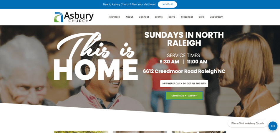
The combination of a clear header menu with links to the entire site, a hero section with call-to-actions (CTAs) to the relevant pages, and a footer menu allows site users to explore the entirety of the website without facing navigational bottlenecks. Additionally, the website is functional; you'll not face any dead links as you use the website.
#3. Conversion-Optimized
AsburyRaleigh.org uses a combination of CTAs that link to different landing pages, and engaging content helps the church communicate to the traffic and build a rapport effectively. The content is particularly captivating as it helps website users picture themselves as church members, communing with the church congregation.
#4. Cross-Browser, Cross-Device Compatible, And Responsive – We've tested the website for responsiveness, cross-browser, and cross-device compatibility, and it passed. You can use the AsburyRaleigh.org website using any device that can access the internet. Whether you have a budget smartphone with limited real estate or a computer with a large screen, the website renders all elements without any hindrance.
#5. FAQ Section
Near the bottom of most web pages are an FAQ section, where the church answers the most frequent questions they face. The church uses this section to proactively provide useful answers to questions many website users may have. It ensures that site users are not left with questions after using the website.
Website Design
#1. Fitting Typography
The choice of font sizes, color, and styling make for an easy-to-read website, making the site accessible. Additionally, the typography used makes the website skimmable and easy to navigate.
#2. Excellent Site Layout
The website designers have made great use of symmetrical and asymmetrical layouts across the site. They've combined the two layouts in different sections and parts of the website, breaking the monotony that might arise from just one type of layout.
#3. Color Pallet
The website's color palette is chosen with usability in mind. The combination of colors makes it easy to read content and explore the website without straining your eyes. For instance, the site uses a green color (#70AB37) and a blue color (#006EB6) as the main styling colors. These colors stick out of white or image background while creating a pleasing aesthetic. Additionally, using these two colors also helps the church with branding.
#4. Parallax Scrolling
Parallax scrolling is a notable design feature and the focal point of the home page. With a static background, the scrolling foreground grabs the attention of website users. This helps break the monotony of scrolling down the website. Additionally, grabbing the attention of website users allows users to note the messaging in that specific block. In this way, the designers of asburyraleigh.org enhance the conversion rate.
Content
#1. Niche-Related Content
Every content is related to the church and its activities. The niche-focused content helps readers understand what the church is about, its culture, and its traditions. This helps prospective churchgoers appreciate what they're in for if they decide to attend the Asbury Church.
#2. Easy To Read Content
The website has easy-to-read content, devoid of any jargon across the website. Additionally, the content is well written and does not have typos and grammatical errors that may affect how website users understand the content.
#3. Ever-Green Content Is Up-To-Date
Ever-green content, such as the "About Us" copy, is up-to-date. Whatever site users read on the website is current content.
Search Optimization
#1. The Website Has Implemented All The Fundamental SEO Gold Standards
As far as SEO goes, the website has performed all the basic optimizations expected of a website church. For instance, its content is optimized to target keywords related to the church naturally. Additionally, the site is speed-optimized and focuses on providing users with a stellar experience. All these considerations play a part in helping the site rank well on search engines.
#2. Local SEO Optimized
Given that churches tend to target local traffic, the website is optimized to rank well on local SERPs. For instance, it delivers localized content targeting the local population. The site designers also optimized the site for NAP (Name, Address, and Phone number), which is essential to local search rankings.
#3. Image SEO
The images have been perfectly optmized to inform Google and other search engines of what they images mean and where the church is located.
#4. FAQ Block
The church can proactively answer frequently asked questions by including an optimized FAQ block near the bottom of most pages. Additionally, the FAQ blocks optimize the website to rank well on the "People Also Ask" section of Google's Search Engine Results Pages (SERPs).
Final Thoughts
As far as church websites go, AsburyRaleigh.org is a highly optimized website that's thoughtfully designed to meet the church's needs while exceeding the expectations target audience. The website designers have made great efforts to optimize their website's overall design, content, UX, and SEO. Not many churches pay attention to their online presence; AsburyRaleigh.org is an excellent example of how churches should create an online presence.


