Site Builder
Highlighted Features
Pages & Blocks
Build and customize your church's website easier than ever
Small Groups Manager
Connect with believers through Bible study and fellowship
Holiday Bundles
Save time preparing for your biggest services of the year
Sermons Manager
Watch, listen, and share inspiring biblical messages
Events Manager
Stay updated on church gatherings and special occasions
Online Giving
Enable secure and convenient donations for your church
Use Case
Next Steps Framework
What makes Ministry Designs different? Find out here
More Website Visitors
A church website is only as good as its flow of traffic
More Sunday Visitors
An effective website will help drive visitors to your church
More Community
Encourage more connections weekly through your website
More Engagement
Your website should be the central hub for all church activity
More Small Group Attendance
Small groups made clear, accessible, and easy
Increased Visitor Engagement
Make it simple, point new visitors to your website
More Efficiency
Intentional communication leads to higher efficiency
Brew City Church Website Tech Stack
Church Website Builder
Brew City Church Website is Built on the Omage Church Website Builder
Church Website Design
Brew City Church Website Design was done by Ministry Designs.
More Church Website Examples
Click here to see a full list of Church Websites
What Church Website Template was used?
Brew City Church used kit 2 of the Omega Church Website Templates
Review of the website:
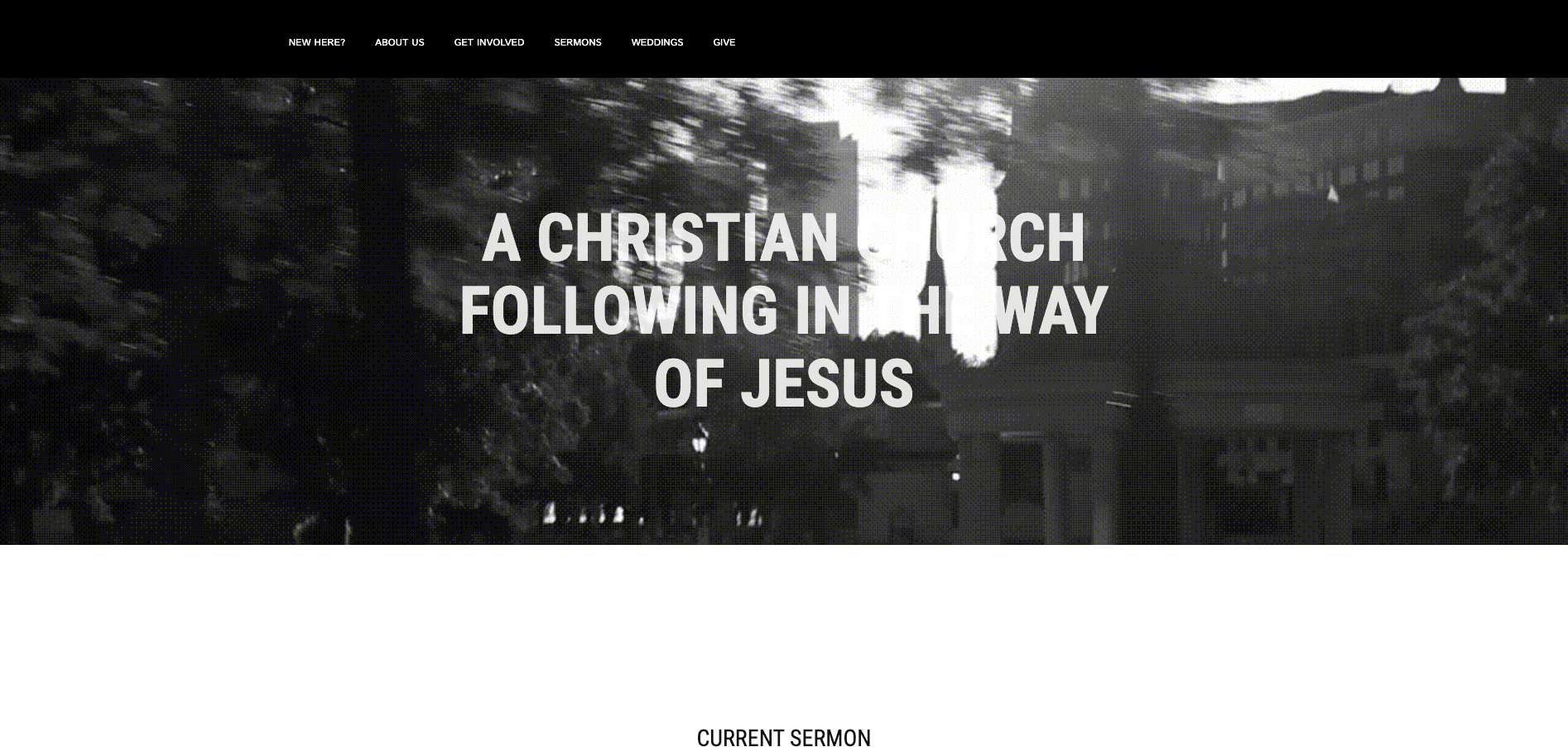
BrewCityChurch.org is the main web property for the Brew City Church. While the custom site has a wide variety of features of a typical website, the implementation of the website design ensures it works well as a church website. Herein we'll explore what this website does right as a church website.
User Experience
The user experience of a website pertains to how easy and intuitive users can navigate the website and find the information they need. Below are some aspects of user experience that BrewCityChurch.org has gotten right.
#1. Excellent Functionality And Navigation
The foundation of a fantastic user experience is navigation. Brew City Church's website has gotten the navigational aspect perfect to a tee. For starters, it has a clean, easy-to-use, sticky header menu that allows users to navigate the website regardless of scrolling down. Additionally, the website uses in-content links to improve users' navigational experience further.
#2. Cross-Browser, Cross-Browser Compatible, And Responsive
Having tested the website on a number of popular browsers and various devices with different capabilities and operating systems – mainly iPhone's IOS and Android devices, we know you can use the website of virtually all devices that have internet access. You can access the website and interact with various built-in elements even when using 3G-only devices with a throttling internet connection.
#3. Usability-Optimized
BrewCityChurch.org is designed with simplicity in mind. You can quickly get to grips with using and navigating the website. Notably, the website packs all the features expected of a modern church website. It links to the organization's social platforms, embedded videos, and podcast apps where church members can listen to the summons.
Website Design
#1. Fitting Typography
BrewCityChurch.org uses excellent typography. The color, styling and font sizes make for an easy reading experience. The website has perfect contrast that renders excellent accessibility.
#2. Logical Site Layout And Structure
The site's structure and layout are deliberately designed. It is not cluttered with unnecessary features that add no benefit to users. BrewCityChurch.org uses a minimalist design that's implemented to perfection.
Content
The content created is the primary means of communication between the organization and the website users. BrewCityChurch.org has optimized its content to communicate effectively with website users.
#1. Website Uses Original Niche-Related Copy And Content
The website is populated with original niche-related content. Whether you're reading about the church in the "Our Story" section or the Statement of Faith, the content you'll encounter speaks about the church, its ethos, culture, and members.
#2. Grammatical Errors-Free Content
The content on the website does not have any grammatical errors, making it easy to understand. Grammatical error-free content is also essential in SEO, as Google does not rank websites with grammar errors well.
#3. Ever-Green Content Is Up-To-Date
The ever-green content on the church website is up-to-date and relevant. For instance, the statement of faith is well-written and relevant to the church, culture, beliefs, and message.
#4. Easy-To-Read Content
As you browse through BrewCityChurch.org, you'll not encounter technical jargon related to the church. The website uses simple and everyday English that everyone interacting with the website understands quickly and intuitively. By using easy-to-understand English, the church does away with any barrier to communication.
#5. Website Uses Optimized Multimedia Content
The website uses a myriad of multimedia content to enhance communication with users. It features several videos that explain different aspects of the organization. Importantly, the Brew City Church embeds a YouTube video of their Sunday services giving church members and prospective new church members access to old services and teachings.
Search Optimization
#1. The Website Has Implemented All The Fundamental SEO Gold Standards
A fundamental principle of any SEO strategy is improving the user experience. As such, every optimization that improves users experience also enhances the site's SEO. Everything the website designers optimized for user experience, including optimizing the site structure, navigational optimization, optimized footer and menu, effective call-to-action implementation, using a .org domain to denote the nature of the website owner, and much more, enhances the SEO performance of the site.
#2. Local SEO Optimized
BrewCityChurch.org is optimized for local SEO. It delivers high-quality local content relevant to the church, niche, and location. To this end, the website includes content that explains various aspects of the church's site. For instance, the homepage has a " Parking " section that provides a parking map. Such information helps churchgoers to understand the logistics of attending church services at the Brew City Church.
The website also includes a NAP section (Name, Address, And Phone) at the website's footer. Nap is an essential element of local SEO optimization, giving the church a consistent identity.
Finally, BrewCityChurch.org includes an embedded Google Map in the footer with a pinned location of the church. Any website users would find it easy to locate the church by simply using the map on the website. On the SEO front, BrewCityChurch.org has claimed its location on Google My Business, enhancing its performance on local searches.
#3. Website Is Linked To The Organization's Social Media Channels
BrewCityChurch.org has all the church's social platforms linked within the website. There are footer buttons linking to Facebook, Instagram, Twitter, and Apple Podcast, and an email button. There is also a Twitter feed tile on the homepage.
Final Thoughts
There are many elements that the BrewCityChurch.Org does right. While the website design is simple, it effectively provides users with all the necessary information they need to interact with the website and the church.


